Category: Project Management

Top Web Trends for 2018

We don’t know about you, but 2017 was a pretty awesome year for us at the Areli Group! With our pipeline stacked, our processes fine-tuned and team continues to grow; we’re ready to take on everything 2018 has to throw at us. Last year’s web trends post was a hit, so we figured we’d continue it this year! Our goal is to help guide your brand towards the features and necessities your website should have to avoid becoming outdated.

Web Trends of 2018

With so many buzzwords flying around the web right now like cryptocurrency, augmented reality and more it’s easy to get distracted or overwhelmed by the latest craze.

You may notice that this list possesses some of the trends we acknowledged last year. We’ve included them again to emphasize their importance as the internet’s landscape continues to evolve.

So let’s get started!

Engaging, Visual Content

The need for more content will only continue to be in demand as each year progresses. Consider how many voices there are out there shouting to be heard across the web. One of the best ways to improve your web presence is to consistently produce original content that keeps your audience engaged.

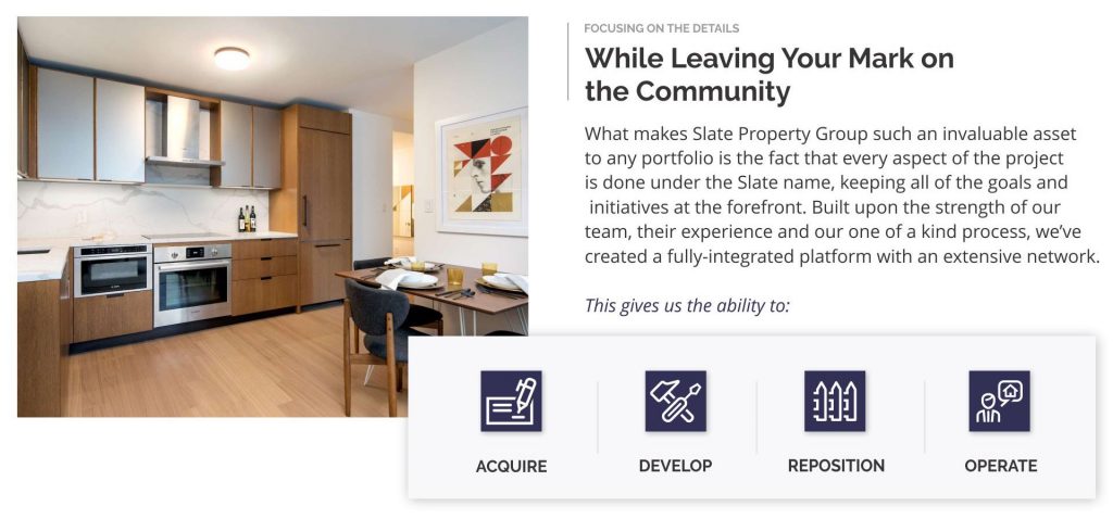
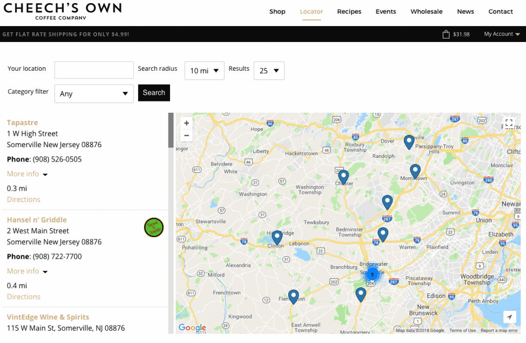
When it comes to showing people where to find your product, pictures can speak much more than words on the page. Just ask Cheech’s Own!

web trends

If you are not utilizing visual content such as branded images and videos then you are missing out on a large part of your potential reach. Applying your content to visual formats can help the content’s exposure as images and videos tend to be much easier to absorb on the move. One way to do this is to use the content in a visually appealing way that reinforces the copy.

By using a broken grid layout (which we’ll get into more later on), you can guide the user through a smoother reading path than the traditional jagged, alternating content layout.

Vibrant Colors & Textured Patterns

Staying with the visual content category, let’s talk about overall design and color schemes. The prevalence of flat design is still strong. That said, there are attributes about it that are evolving, including the use of textured patterns subtly used in backgrounds or the use of unique shapes.

web trends

Let’s also make one thing VERY clear. It’s 2018, your website should NOT have any FLASH on it. Most browsers used currently do not even support flash anymore, just ask Adobe!

web trends

One design scheme really taking center stage are the broken grid layouts. The stacked look gives the image some depth while drawing the individuals eyes towards the content that matters the most. It will be interesting to see how brands and agencies use this approach in a unique way to stand out.

Online Support

Part of the experience factors for your website includes how certain issues are approached. Are you making it easy for your followers to contact you with any questions they may have? Do you know your audience groups well enough to intuitively offer the answers to their commonly asked questions? Consider the mindset of individuals looking for assistance. They’re usually confused, frustrated, upset or all of the above.

The way you approach a resolution can be a major differentiator between your brand and a competitor. The easier and more pleasant the process, the happier the individual will be. If you are in eCommerce or offer any type of service, customer support should definitely be a top consideration for you this year.

AI & Chatbots

It can be difficult to consider how you can improve or maintain your customer support initiatives while trying to scale your brand. Rather than spreading yourself or your team too thin, consider the use of chatbots and AI. With every year they become a little bit smarter, a little bit more intuitive. While auto-responding bots set for various scenarios may not be ideal for your brand, it could be helpful to gate or direct visitors to certain pieces of content. A great resource to try is Intercom, which acts as a digital concierge for any customer service requests you may receive.

Micro-Interactions

With so much content out there, how are you capturing the attention of your visitors? Besides using the latest web trends and having a diverse amount of content, are you giving your visitors the experience they expect? Through the use of micro-interactions on your website, you can provide your visitors with an intuitive experience they’ve grown accustomed to while having a bit of fun through the development process of your website. From the simple to the complex, your website’s use of micro-interactions could be what sets your website apart from a major competitor.

[codepen_embed height=”500″ theme_id=”0″ slug_hash=”XZOWve” default_tab=”js,result” user=”keitpetrillo”]See the Pen How to Animate a Coffee Drinking Sprite With ScrollMagic by Keith Petrillo (@keitpetrillo) on CodePen.[/codepen_embed]

Accessibility & Security

If you aren’t aware, 2018 is the year for you to keep this on your radar! Over the last few years, new guidelines have been set to assist those with disabilities navigating through the web. Categorically, those with motor, cognitive, visual, or hearing impairments need to be considered as you design and develop your website.

You can find the full set of guidelines here.

Additionally, if your website doesn’t have an SSL certificate you should get that resolved ASAP. Google has made it a requirement, which means not having a secure website in will affect your search rankings and more.

Responsive

This is the last one because at this point it’s not a trend, it’s a necessity. It’s 2018. According to a recent study from socPub, 57% of users won’t recommend a business if they have a poor experience on their mobile site. With so many users accessing the web from their smartphones or tablets, the time to merely consider a responsive framework is over. You need to make sure that when you are in the website design and development process you are working on your mobile version sidecar.

A great example of keeping mobile in mind is Dribbble, which was recently showcased in a post from Invision.

Use What Applies

As always, consider what could work for you and your brand and what doesn’t. It never makes sense to go forth blindly into the year. Put together a plan based on the data you’ve collected in 2017 to ensure any issues are resolved as you move forward.

While many of these are suggestions, keep in mind the importance of accessibility and a responsive layout. Both will greatly help you gain more traction in the years ahead!

How to Set a Website Budget

It’s the New Year which means you have some hefty goals to accomplish over the next twelve months. Maybe one of them is updating your ancient website, which has been looming over your head for a while but you’re not sure where to start.

Even if you don’t go through an agency, the biggest task ahead of you for a website project is how to budget it correctly. To do so, you need to understand the factors that are involved, from the technical aspects such as hosting to how you hope align your website with your upcoming business goals.

Do You REALLY Know What You Need?

When you are trying to set a website budget, one of the first things you need to consider is the end goal. What are you trying to accomplish with the new website? A website can have many roles within your company from mere validation to lead generation and increased sales. Refreshing or launching a new website can be a great time to get on the same page with other departments if you have not done so already. Discuss what the overall goals are for the company and what each department is doing to help accomplish this. This will set the landscape for how the end-product can help keep all of the goals aligned. What are some of the technical aspects you need to consider? Are you going to be hosting it yourself? Do you know how to choose a hosting provider or setup a server?

After identifying how the website will be used will help you understand how you should develop your website. There are a few options you can choose from:

DIY Builders

There are a lot of services out there than can help you create a website in minutes. They use drag and drop features to easily lay out your website and populate it with content. If you have a limited technical background and are working with a lean budget DIY builders like Wix or SquareSpace can be a good solution. Keep in mind though, because they are drag and drop, many of these builders lack any true customization which can be limiting. Some may find the layouts to not be aesthetically pleasing and can become frustrated over the experience.

Packaged CMS

This refers to a content management system ready to go out of the box. WordPress is a great example of this, as it is easy to use while still giving you a wide variety of custom features. From themes you can purchase and customize to getting nerdy with the CSS and actual code, WordPress and packaged CMS can be a great choice. We would recommend working with a web developer or agency to design, develop, and configure your website which can affect the budget based on their hourly requirements. By doing so you can get the most out of the platform with the ability to update and maintain the website easily after it is launched.

Custom CMS

If you are a content powerhouse or large company a custom CMS could be a better option for you. Rather than fitting with the confines of other platforms you are able to build yours from the ground up. This is definitely much more technical and would require a skilled in-house creative team or an outside agency to assist you.

Are You Being Realistic?

Two things that can kill any website budget is the timeline and your perspective as a client. You can’t expect to get a Bentley for the price of a Honda. Websites also do not magically happen overnight.

If you want your website designed, developed and launched correctly, there are some aspects to stay mindful of.

Timeline

If you want a website that has been well-thought out, designed around your audience and possesses engaging content and aesthetics you need at least three months. This allows the various teams to acquire the information they need, create designs, revise based on your feedback, and do quality assurance prior to launch. Timelines are also based on the correspondence with the point of contacts, which means if something is on your end for review and it’s been a week, the project will start losing momentum.

Perspective

We all want the best of the best but what we’re willing to spend ultimately determines what we can walk away with. We always suggest creating a wish list, which compiles everything you want in a website and more.

Part of the Areli Group’s Discovery process is comprised of an exercise combines attributes from the MSCW method and a traditional SWOT Analysis.

MSCW Method: (Must.Should.Could.Would/Wish.) During the initial call, we will discuss what your website must have, such as content keypoints, basic functions etc. The ‘should and could’ categories cover features that would strengthen the end-product, including micro-interactions, modals, and more. The ‘wish’ category is purely conceptual, but the discussion alone can help an agency like ours truly understand your full vision for the company in the years to come. You can find an example of the MSCW method here.

SWOT Analysis: When you are taking the time to consider how you can improve your website or overall brand, try doing a SWOT analysis. Pick three or four of your competitors and review the following:

Strengths – What does each brand (including your own) do well? How is each using their content, positioning their brand, and connecting with their audiences? What are they doing that you could be doing as well?

Weaknesses – Whether their website is hard to navigate through, or the content leaves you confused take note. You can use your competitors’ weaknesses as a list of thing you can do better on your end-product.

Opportunities – Once you’ve identified the weaknesses of your competitors you can start to outline potential opportunities for your brand. If your competitor lacks educational content on their site, you can list ‘engaging, educational pieces of content’ as a goal. This way your end-product can offer more value than what your competitors currently have.

Threats – I always consider the threats section as a list of ‘Things to Keep on Your Radar.’ This can include upcoming campaigns, partnerships, social strategies and more based on your research. To me, this section helps put you in the mindset of, ‘Hope for the best, plan for the worst.’

Here’s a good example of a SWOT analysis template that you can use.

From there, you can select the top priorities, which should be features or functions you must have to launch. Consider everything now so you can work through all of the kinks, and reflect on if this project can be done in phases.

Cutting Corners Never Works

As you put the finishing touches on your requirements lists, always remember – Cheaper is never better. Why entrust your six figure company’s website to someone who doesn’t have your best interest in mind?

Working with your in-house team can limit the overall perspective while cheaper agencies and overseas solutions can remain one-dimensional if they’re not considering your overall business. The cheaper the price tag, the less questions they will ask, and the result will be misaligned, and not worth the money you potentially saved.

When It’s All Said and Done

Ultimately it is up to you to set the right budget for your website project. By creating a brief of your requirements and goals you can start asking the right questions to get buy-in from the decision makers. Remember that your website is an asset to your company and should never be undervalued. Working with creative agencies that take the time to understand your overall business goals can be a great solution if you lack an in-house team or just want some outside perspective. Be careful of working with overseas development teams though, we personally have had to rectify and fix many projects that had become misaligned from the client’s needs due of the lack of consideration from them. It’s better to work with a team that has your best interests in mind, from start to finish.

Setting Client Expectations

While projects come in all shapes and sizes, one thing should always remain the same. The approach. It doesn’t matter if it’s a $3,000 website or a $300,000 software build the same methodologies apply. More often than not, agencies will silo the communication, keeping the client in the dark. What tends to happen are bottlenecks to the work, a lack of accountability, and scope creep. The remedy for this is much simpler than you would think. You just have to communicate with your client.

Yes, communication is key. It can mean the difference from a great experience with your agency or deal with an avalanche of negative reviews.

Staying in Control

As the agency or freelancer, it’s up to you control the project. The client is looking to you for guidance. It’s up to you to set the pace, the early stages of the project are important. You want to ensure that you have everything you need to produce an exceptional product that strengthens your client’s brand, so always keep the bigger picture in mind. How does this act as the cog for your client in the long run? Does it align with their current campaigns? What are their overall goals for the year? These are all questions or talking points to have with your client as you create the scope of work. This can alleviate running into situations where you need to adjust midway through the project. The last thing you want is to accommodate an overlooked aspect such as a promotion or campaign at the project’s tail end.

Simple Communication

A good rule of thumb is to always recap a client conversation while addressing any outlying tasks you need to address. By creating a regimented schedule for weekly sync-ups you can control the pace and address any concerns you may have. This also gives the client an opportunity to review the project’s progress and offer insights on certain priority tasks.


Watch Out for Scope Creep

The struggle of scope creep is real! When you lack communication or grasp of the larger picture this can cause some disputes as the project progresses. Scope creep refers to when a client asks for changes or additions that were not originally discussed. They assume it’s included, though there are occasions where a client will see if they can get a foot of rope when asking for an inch. By using a scrum or agile approach, you keep an open channel of communication with a point of contact and alleviate this. An agile approach is more iterative, which allows the project to grow based on the needs of the client. It’s usually broken down into phases that can be adjusted after the initial project is kicked off. Using scrum methodologies, your team and the client’s point of contact sync up weekly which keeps the top goals as the main focus and address any issues that may prohibit the project’s progress.

Assigning Accountability

We all want to see the best in people, but there will be occasions where clients may try to see what they can get from you without paying extra. If you have a team of designers and contractors they may try to ask them directly for the additional work rather than going to the project manager. On the same side of the coin, you must hold the point of contact you and the client have agreed on highly accountable. Even if your point of contact asked for a certain feature, it’s not your problem if it wasn’t initially requested. If you or your agency have spent time on it, you must be paid for your work. An accountable POC also helps during the approval process. It will help you avoid ‘having too many cooks in the kitchen.’ That alone will help avoid potential bottlenecks and the loss of project momentum.

Harsh Transparency

To reiterate, you or your agency should have the control in this situation. It doesn’t matter if this is your biggest client or if it’s your first one. If a client requests something that is out of scope or you see potential delays on your side, speak up. Don’t wait until the last minute to ask for more money or to let them know you won’t be meeting the initial deadline. It may be a difficult conversation to have ahead of time, but it will save you an even worse conversation weeks later. More importantly, it will not drastically affect you or your agency’s integrity. If anything, you would be more respected for putting yourself out there rather than trying to hide it. Honesty will always get your further.

Lastly, the client isn’t always right. Just because they’re the ones paying doesn’t mean you become a yes man. They came to you for your expertise, so use it. If they want to spend money on an archaic function or layout, explain to them why this isn’t such a good idea. Regardless of if it means fewer hours you can bill. Show them you’re in it for more than the money and will translate into a better customer experience.

Better Communication, Better Experience

To sum it all up the best way to successfully set client expectations is to keep an open line of communication. Make sure you have someone on the client’s side that is accountable for approvals and decision-making and doesn’t avoid giving your client the full picture just because you hate conflict. You’ll thank us in the long run!

Creating a Content Strategy

There’s a common thread that all companies share. Regardless of if they’re a startup, mom and pop business, or corporation – their success is determined by the demand of their buyers. It doesn’t matter if they are a B2B or a B2C, at the end of the day, a customer is a customer. Even though the web has made it extremely easy to capture the attention of more leads, it also has opened up the floodgates for many competitors to do the same. So here’s the ultimate question you and every other company faces: How do I stand out from the crowd? The answer is so simple it’s most likely a bit redundant at this point. It comes down to your content strategy.

Content is key.

Content has the power to steal the light from big budget companies and can also be the last nail in the coffin for others. While the concept of creating content is simple, it comes down to the overall strategy and execution that separates one piece of content from another.

We’re firm believers in the power of content and a strong content strategy. It can be a double edged sword though, so we’re going to offer some tips and tricks to make your content work for you rather than the reverse.

A Content Strategy for the Win

Let’s discuss how content plays a key role in your success. Through your website’s copy, blog posts, ads, social media and more, the words and images you use can affect how potential consumers see your brand. If you’re focusing on one more than the other you can miss opportunities. If you focus on them all without the right strategy or manpower, you can spread yourself too thin and can miss deadlines. Hence why we call content a double-edged sword.

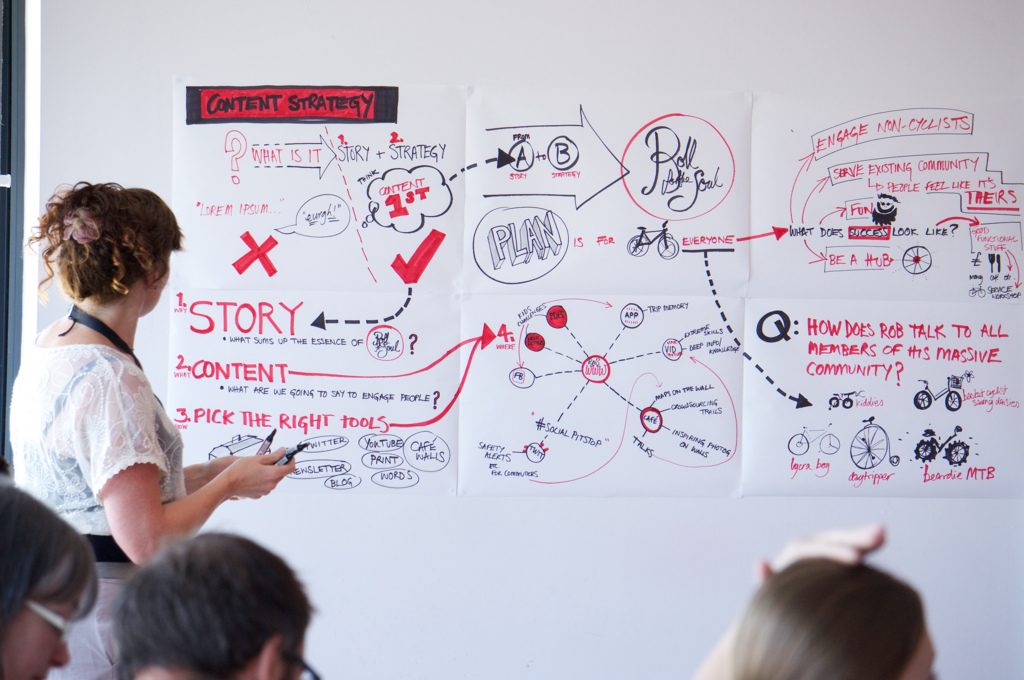
A strong content strategy has the power to make your brand seem larger than life. You can rub shoulders with other big name influencers even if you’ve only been around a fraction of the time they have. Your content strategy should be your plan or a roadmap. Before you even start writing a blog post or adjusting your website copy, you should ask yourself, ‘What am I trying to accomplish?’ Consider what your overall company goals are and how you could make your value proposition shine throughout. Another factor we think about before drafting anything is the types of questions we have received or issues we have come across ourselves. From there, a list of topics and ideas begin to form, giving you a blueprint of pieces of content you can create.

When people see the term ‘content’ they tend to think of just simple text or website copy. The truth is, your web content should extend beyond the realm of copywriting. Images, videos, infographics, and more are all considered content and should all be utilized within your overall content strategy.

Keep it Diverse, Keep it Fresh

A well-formed content strategy surpasses blog posts and website content. As I mentioned above, content is more than just text, and your strategy should reflect this. There will always be a situation where a picture speaks louder than words. Branded images are a great way to catch a follower’s eye and keep them engaged. Something else to consider is the goals of your strategy. If you want to increase conversions, you may want to create an incentive that you can gate for their contact info, such as an eBook or white paper.

Different Types of Content Formats

Infographics
The days of boring Excel pie charts and scatter graphs are over. Visually data representation needs more of an artistic flair to stand out. This gives creative teams the ability to flex their design chops and create engaging pieces of content out of boring data. They’re a great way of offering valuable data and information to your followers without putting them to sleep.

Click here to see the full infographic


Videos
With so much content at the fingertips, there are going to be instances where people would choose a more condensed version than what you’re offering. We’ve got short attention spans, and only serious followers will read your 10-page post on a topic such as link building. The fact of the matter is when a shorthand like tl;dr (too long; didn’t read) becomes mainstream it’s time to make content as easy to digest as possible. Many times this can be solved through the creation of a video or video series on certain topics. You’re able to cover a lot more ground in less time while using visual aesthetics to keep the audience engaged.

Memes & Gifs
Unless you’re a straight-laced corporate business, throwing a little whimsy and fun into your social and online strategy is always good to try. They’re usually fun and silly, shining a spotlight on some of the more relevant aspects of society. There are some instances though where you can use a GIF to demonstrate an action or function which helps those who fall into the category of visual learners. Use them sparingly and try to keep them to blog posts and social.

Ultimately there’s a time and place for all of these types of content. When creating a content strategy it’s definitely something to keep in mind. Don’t overcomplicate it either. There’s nothing wrong with taking a written blog post from a year ago and creating a video out of it. The same applies to infographics, case studies, eBooks, etc. If you are already taking the time to create the content, why not use it in as many formats as you could?

Consistency is a MUST

Focus on keeping your content strategy on a consistent schedule. When it comes to your content strategy and posting schedule go for the tortoise’s approach rather than the hare’s. Focus on the content you are producing, take your time and follow a schedule that is manageable with all of the other daily tasks you may have. Instead of going hard and posting every day or week and running out of time to produce quality pieces, do what you can maintain. It’s always easier to scale up and increase your posting schedule. With the hare’s approach, scaling back can actually be detrimental and affect how audiences perceive your brand. A content calendar can help you remain focused on your weekly and monthly tasks. You can find an example of one here.

I’ve mentioned this before but it remains true. Quality over quantity will always win. You should never sacrifice the quality of a blog post for the sake of a deadline.

TL;DR

To sum it up content is key. It’s the life force of your brand and the best way to engage with your audience. Quality should always remain ahead of quantity as you create content, schedule posts and maintain consistency. Use diverse content formats like infographics and videos to accommodate the various preferences of your audience. Most importantly, enjoy what you’re doing. You should be psyched about your content strategy! You’re on your way to becoming an industry influencer, so enjoy this process!

Getting Started: Website Development and Design Basics

Whether you currently have a website or are in the process of creating one, there are a lot of basic fundamentals your finished product must contain. While many will look for the ‘cost-effective’ routes of doing it in-house with limited platforms like Wix and Squarespace, those who want to really succeed will understand that more effort and capabilities are needed to stand out among the competition.

At this point, everyone is connected to the web in one way or another. From smartphones and mobile devices to services like telemedicine and mobile payment processing, everything is connected to the constant stream of data surrounding us. While this makes it easier for brands to connect with their consumers, it becomes a double edge sword when you consider the amount of time and effort required to remain ahead of the competition. This post will give you an idea of website ‘must-haves’ to stay competitive.

The process of creating or even redesigning a website can be overwhelming, but it doesn’t necessarily have to be. In this post we’ll cover the basic fundamentals your website should definitely possess while offering some insight on how to actually get it accomplished:

  • Choosing a CMS Platform
  • Content Strategy
  • Responsive Design
  • Search Engine Optimization
  • Brand Alignment

Where to Begin? Website Development Core Basics

Let’s start off by discussing how to choose the right CMS platform to use as the foundation of your website. A CMS platform is a content management system, a software that is used to create and manage, you guessed it…content. You have your basic platforms, your custom CMS infrastructures and even those that are created for high volume, enterprise levels of content.

There are a lot of great options out there with different capabilities, including:

Our preferred CMS is WordPress.

When you’re looking for the right CMS for your brand, consider what your needs are. What are you trying to accomplish? Unless you’re a big brand looking for enterprise level integrations and capabilities, such as churning out a ridiculous amount of content across multiple websites WordPress tends to be the ideal choice. The amount of customization, open integrations, and capabilities of the platform makes it a powerhouse CMS in the right hands.

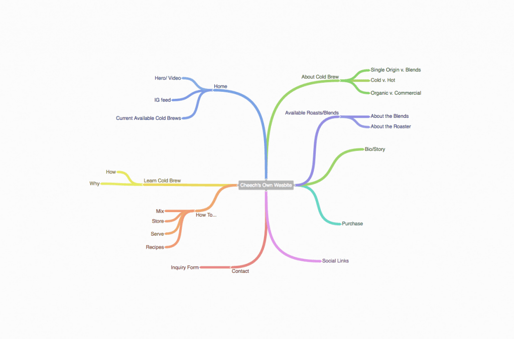
Now that you’ve selected the right foundation for your brand, you can dive into the structure or layout of your site, which lays the blueprints for the overall design and aesthetics. For us, we use Coggle to create sitemaps and outline the content for each page. A mind map is a great tool to use so you can focus on the specific purpose of each page while remaining mindful of the bigger picture goals. Here’s an example of how we use Coggle during the planning phase for most of our projects.

Once you’ve adjusted your sitemap based on your needs and have a CMS platform in hand, here are the other four key components of any killer website:

  • Content Strategy
  • Responsive Design
  • Search Engine Optimization
  • Brand Alignment

Content Strategy

Regardless of what you may read or what you have experienced in the past, content is king. Without it, the result would be similar to a ‘big-beautiful Cadillac with no engine.’ It may look amazing and snappy on the outside, but there are no guts to hold it together. In future posts we’ll definitely be focusing on your content strategy but until then, here’s what you need to keep in mind:

  • Your Target Audience
  • Overall Goals
  • What’s Your Value Prop?
  • Keeping Content in the Queue

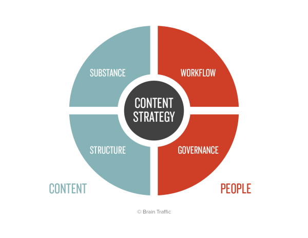
The Content Strategy Quad, copyright Brain Traffic

Your content strategy spans across your entire brand, with your website being one of the cogs in a larger machine. After you’ve identified the right messaging for the right audience, there’s much more work to be done. As you create or redesign your website, consider how your messaging will play a larger role in your content strategy. Each of your value props should be a running theme for all of your blog posts, social media plans and more. Every message, line of copy or blog post should serve an overall purpose, whether it’s solidifying your brand as an influencer, increasing your followers or improving your conversion rate. You should never go into drafting blind, and you should always have a clear idea of how this piece fits into the puzzle.

Responsive Design

We’ve spoken on this topic before, but it remains true and will only continue to increase as the years go by and technology improves. Having a ‘mobile-first’ type of mindset will allow you to create an overall positive experience for all of your visitors regardless of their preferred device. Using a responsive design approach gives you the ability to ensure your website looks just as good on any mobile device as it does on a desktop. That’s the ultimate goal, isn’t it?

Consider how often people are on their smartphones and tablets versus on their desktops. We always have our phones on hand, and will constantly use it for research and browsing purposes. When creating or revamping your website, you need to consider how you can provide ALL Of your visitors with the best web experience regardless of the device. Keeping your information easily accessible is the best way to increase your page on-time and engagement metrics.

Search Engine Optimization

There’s so much noise out there on the web, it’s difficult to differentiate yourself even with all of your experience and credibility. One aspect that many companies fall off with is in their rankings. What are you doing to keep your website at the top of search results? Are you being found for the right terms and keywords? Search Engine Optimization is a fickle mistress, constantly changing her needs and wants based on the habits of consumers. What may have worked years ago is not guaranteed to work now, especially if it was closer to black hat techniques. That being said, it’s absolutely necessary to keep your finger on the pulse and identify the best tactics that will help your brand stand out.

At the very least, your website should have all of your meta-information optimized, a focus keyword for every page and overall configuration for efficient loading times. That’s only the beginning. Looking at the bigger picture, your overall content strategy and your SEO efforts should be working in-line, as you can’t have one without the other. Well, you can but it won’t really do jack for you. The more optimized content you produce, the more links you have pointing back to your website, the higher you will go in search rankings. More importantly, search engines like Google then consider you a much more credible source, which also affects your search performance.

Be sure to lookout for our upcoming post on best practices for SEO to learn more about how to get started.

Brand Alignment

If you’re going to take the time going through the entire web design or redesign process your ultimate goal should be to keep your overall strategy and approach aligned. If you have any silos within your brand working on different things, take a moment to understand how this can result in a disjointed, inconsistent appearance and actually hinder your brand in the long run. You create a stronger brand when you are all on one page rather than working on your own goals.

A unified approach gives all of your teams the perspective they need to understand how their responsibilities fit within the company’s overall plan or vision. It’s a great way to keep your team engaged and more importantly, will create more effective results than you were receiving prior. If you’re going to invest the time and money into a website or a redesign, it’s imperative that you also align your strategies to follow the launch and capitalize on the momentum.

To Sum it Up

In the end, the most important aspect of any web redesign or build is to remain focused on the big picture while taking care of the specific tasks at hand. Any distractions or loss in momentum can affect how cohesive the finished product is. Your overall goal should be to ensure a seamless approach with your other efforts when launching. Finding the right CMS platform, creating a strong content strategy, and keeping mobile in mind when designing will get you started on the right track. By using the insights offered above you can make sure you are taking care of the core fundamentals to your website.


Top Web Trends for 2017

2016 had its fair share of ups and downs, but one thing is for certain. The power of the web and digital marketing is growing exponentially, which can be great for some and daunting for others. If you’re slow off the starting line for transitioning into the digital realm, don’t panic. There are a lot of simple ways to bring your brand to the digital landscape, going beyond the traditional website format and a handful of social posts. Let’s take a look at some of the top web trends that picked up quite a bit of momentum in 2016, and how they will play a role in the years to come.

In a nutshell, we’ll highlight the importance of:

  • Mobility & Responsive Design
  • Flat Design’s Evolution
  • Content’s Overall Impact
  • Diverse Content
  • Quality Over Quantity
  • Creating a Personalized Experience
  • Micro-Interactions
  • Filling in the Gaps with Automation
  • Destroying the Silos
  • Real Data Over Vanity

We hope that with some guidance, your journey through the digital world will be less scary and more exciting!

Mobility & Responsive Design

According to a report by Ericsson, 80% of the world’s population will be smartphone users over the next 4 years. That’s over 6 billion people with the ability to access the web, apps and more right from their phone, no matter where they are. In 2016, there were more consumers browsing the web on their smartphones than desktops, which means you need to start considering your mobile design first and foremost.


top web trends

For us, mobile always comes before desktop. There’s no point in spending all of this time on a website that looks great on desktop and like crap on mobile. Just think of how you search for information when you’re on your phone versus desktop. A responsive design requires more thought on the overall user experience. How are you providing your visitors with the information they’re looking for in the easiest and fastest way possible? Is your page loading at the mercy of large files and encumbered with complicated functionality? The days of pinching and zooming in to read text and navigate is over. You need to put mobile first.

Flat Design’s Evolution

Even if you’re not familiar with the term, you have definitely encountered a fair share of flat design examples over the last year, and there doesn’t seem to be any sign of stopping. Using a minimalist approach and vibrant color schemes, flat design quickly replaced skeuomorphism as the industry standard for all digital design facets. Through the use of simple shading and contrasting colors, flat design has helped users navigate through websites with more ease while creating an immersive experience.

top web trendsPersonally, we’ve always been fans of flat design. Skeuomorphism always seemed a bit off to us, and the amount of detail they require always came with large image file sizes that would bog loading speeds and overall site performance. By keeping it simple and using a minimalist approach you can flex your creative muscles by creating a flat design that looks great on everything, while also optimizing your site’s page speed and efficiency.

As 2017 progresses, be sure to transition your graphics and branding to a simpler look mirroring the characteristics of flat design to help your brand stay relevant and not look outdated!

Content’s Impact

It has become pretty simple for anyone to create a website or blog. That said, the web has become congested with people sharing their personal content hoping to go viral. With all of this noise, it can be difficult for brands to get their message out there to the right audience. Still, producing content is better than just ignoring it. Whether you are a startup, a small business or a big brand, you should always be producing content. It’s the best method to prove to visitors and potential customers that you are a credible influencer in your industry.


top web trends

Content is key. Without it, you cannot successfully sustain your business. If anything your site will become stagnant as your competition advances. It’s also incredibly difficult for consumers to trust a brand that has no content to support their claims. Consider this, would you trust a surgeon if they couldn’t explain to you the process you are about to undergo? The web is no different, if you’re offering it, you better have the content to show off your proficiencies. A strong content strategy can also help you scout the landscape much better and understand potential opportunities to improve your overall customer experience. Just ask yourself, with all of the competition out there how will you separate yourself from the rest?

Diverse Content

While content is extremely important to your brand, you can’t rely on just a few blog posts each month to pick up traction. As I stated earlier, there is an influx of content being produced every day, every hour so how will you stand out among the rest?

Consider these stats from Contently 

In 60 seconds:

  • 4 million people like Facebook posts
  • 2 million users favorite Instagram
  • 350,000 tweets are pushed
  • 7 Million Snapchats are watched

top web trends

As unfortunate as it is, we’ve become a generation of headline skimming to absorb our information. Our attention spans struggle to keep us focused on the material in front of us for more than a minute, which requires a new approach to publishing content. There are still those who love to get nerdy and read pages and pages of blogs but to accommodate all of your followers, a diverse format strategy is necessary. Visitors have different methods of engaging with content, and the results of trying new methods can be surprising. If you’re going to take the time to produce the content, you may as well do it right. Don’t rely on just a blog post to get your voice out there, get diverse and creative with your content formats. Experiment with podcasts, videos, live streams, and webinars to offer your audience more in ways they will love.

Quality Over Quantity

This point and the two above about content go hand in hand. Don’t kill yourself to produce content, be realistic. If it takes you a month to script, shoot, edit and post a video, so be it! Don’t bite off more than you can chew as you will hurt your brand more than help it. When you have a consistent posting schedule consumers can look forward to new posts and information. If you start out the gate with a post a week and are not able to sustain it, it can reduce the amount of trust they have in your brand.

Whenever we’re planning out our posts or engaging with others we ask ourselves, how does this provide value to others? If we can’t answer the question easily, we go back to the drawing board. Your followers aren’t sheeple, they all have different views and beliefs. More importantly, they all know the difference between real content and click bait. Constantly churning out content that’s just ‘meh’ is the fastest way to tarnish your credibility. You may get an influx of visitors in the beginning, but that won’t last long. They’ll grow tired of your antics and stop visiting or sharing. You can quickly go from an influencer to a spammer in that sense. Quality should translate to all aspects, including your designs, social engagement, customer service and more.

Creating a Personalized Experience

One aspect of the web that has become extremely important in the last few years is the overall user and customer experience. With the competition congesting your industry, an effective method to standing out is to offer more out of the overall experience a consumer has with your brand. This broadly covers everything from your website’s overall page flow, making information easy to find, and more. Make each visitor or customer feel special from the attention and personalization of the website to offer an experience they will surely share with their peers.

Throughout this post, we’ve discussed how it is important to differentiate yourself from the competition. If there is one top web trend to follow from this post, it’s improving your overall customer experience. We all want to be treated with the attention we feel we deserve, and we all want to feel special when visiting a website. Ask a peer to navigate through your site or sales process and get their feedback on the overall experience. Was it warm and inviting or static and cold? If it’s the latter, your main goal for 2017 should be to improve your customer experience. Consider your audience and their needs. What are they looking for? How can you provide them with the information and assets they need? Is it easy to find through your navigation and website?

Micro-Interactions

As we mentioned earlier, we’ve become an impatient generation. We no longer want to just see a page loading bar against a blank white screen. Another one of the top web trends from 2016 was micro-interactions. Micro-interactions (which are interactions within an interaction) play a role in personalizing the overall experience for every visitor, giving them a way to stay engaged with your content or website rather than them getting bored or anxious and leaving the page.

top web trends


We may be in the digital realm, but nothing grinds our gears more than clicking a link and just seeing a stark white page as everything begins to load. It’s the fastest way for us to close out the window and go to someone else’s site. If you are noticing page drop offs, bounce rates, and other discouraging stats, consider adding some micro-interactions to your site or app. Visitors love to discover these and sometimes will go out of their way to show others because of how much they enjoyed the overall experience. If you’re looking for some examples of micro-interactions, just look at your Facebook feed. When you see a post from a friend, you can do a whole lot more than just like or comment on the post. They’ve created a set of ‘reactions’ to offer an emotional connection with a post which brings a new level of experience to interacting with your friends.

Filling in the Gaps with Automation

Now I know you’re probably feeling a bit overwhelmed after reading all of the points we’ve addressed so far, it’s a lot of work! How do you keep track of all of your efforts, post daily, engage constantly and so on and so forth? By automating certain aspects of your work, you can keep your day running smoothly. There are a ton of great assets and resources for you to use out there, from content curators and post scheduling tools to chatbots and more. Many of these have a set it and forget type method, giving you the opportunity to focus on what you need to, while checking in when you can.

For now, automation is helpful, but always keep in mind the human-to-human aspects to interaction. Even if you are using a chatbot to acknowledge and resolve certain issues, don’t let that be the final destination. Always add a bit of human factor to everything you do, so you can keep your brand genuine and stand out amongst the competition.

Destroying the Silos

Another trend that has been gaining momentum over the last few years is taking a more seamless approach. Traditionally, we would push out certain types of content on specific platforms, forcing consumers to traverse through the digital landscape from one social profile to website or another. Now, to provide a better user experience, there needs to be a seamless approach to all of your efforts.

There’s nothing worse than launching a campaign that is not in line with your other departments. It can make you look extremely unprofessional and affect your credibility. By taking the time to understand your brand’s overall initiatives and how each of your departments are involved, you can create an approach that encompasses all aspects. In the end, it helps you create an overall better brand experience through consistency and consumer-driven messaging, which can be a great asset when trying to differentiate yourself from the competition.

Real Data Over Vanity

If you’re monitoring your analytics and social data, keep the following in mind. Forget ‘vanity’ metrics like page visits, likes, followers, and shares. Likes don’t pay the bills, conversions do. Take a deeper dive into your real data, and understand how your visitors are behaving. Look at the time spent on pages, bounce rates, and overall visitor flow. By using real data to improve your site or social presence you can do much more than just fish for likes and shares.

top web trends

We always knew that likes and shares would only get you so far. There’s no ROI on vanity metrics alone. Real data also makes it much easier for board buy-in by showing them the true key performance indicators and a return on investment. If there’s one thing to really consider in 2017, it’s how you are utilizing the data you have been collecting to improve your brand’s overall efforts and performance.

To Sum it Up

While we covered a lot of ground there’s still so much to talk about! We can go on for days about each of these trends. Ultimately all of these top web trends translate into one core message. Digital transformation is key. It’s a sink or swim situation. If you’re not addressing these points above it’s going to be hard for you to stay competitive with all of the other brands. Consider how you can use what you have as a foundation and build off of it. Think about your core messaging and what you want to provide to your clients. Whatever you do, don’t let these trends scare you away from the web. Always keep it simple and go for what you can manage. The rest will start to fall into place once you’ve created a plan. Good luck!

 

10 Best Apps for Startups

best apps for startups

So much to do, so little time. Starting a business or new venture should be a fun and exciting time, but most of the time it’s just frantically chaotic. There’s always a new fire that has to be put out, not enough people for hats not to mention a super lean budget. We’re all supposed to be influencers, showing others how to utilize technology, but many times we don’t practice what we preach.

What can we adjust in our daily routines to boost productivity and ultimately get more shit done? With all of the web applications, digital services, and software inundating the market, what ones are actually worth it? If you’re looking for some industry insight, these are the 10 best apps for startups to use as soon as they launch.

Best Apps for Startups and Agencies

1. Google Chrome

Browser | Pricing: Free

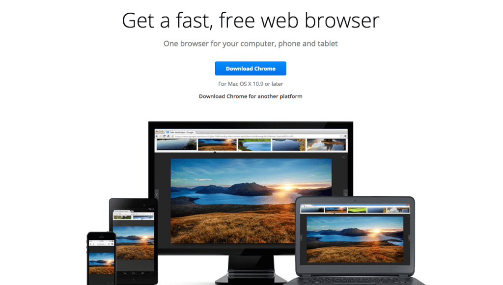
A lot of people know this one, but we’re listing it for those that don’t. You can log into Chrome with your Gmail account and load all your bookmarks, extensions, and information. Great for those with multiple emails.

best apps for startups

We personally use Google Chrome for all of our projects, creating specific browsers for certain tasks such as social media management, design, partnerships and more. Their auto-tab launch (set up a default set of tabs to open up every time you use a window) and their wide selection of extensions like Rapportive makes it an invaluable resource.

2. Google Apps

Web Apps/Service | Pricing: $5 per user per month

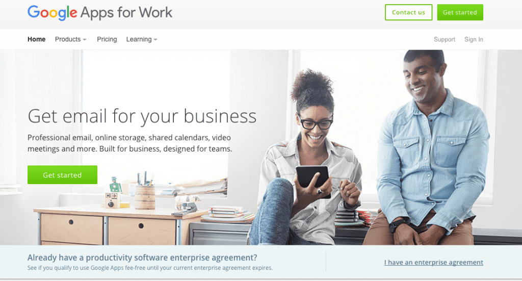
If your startup has some basic vanilla email such as @gmail.com or @hotmail.com it’s time to make a switch.

best apps for startups

Besides a branded email, you also gain access to a plethora of tools for your use, including Google Docs, Sheets, Forms, Google Calendar, and Google Drive. One of our favorite ways to use Google Calendar is to stay synced with our clients for upcoming events, blog posts, calls and more.

3. Basecamp

Web App | Pricing: Starts at $29/month for internal teams and $79/month to invite clients to your projects

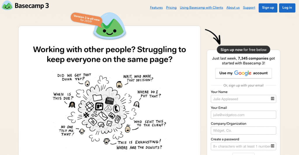
When you’re handling multiple clients, requests, and points of contact it can be tough to manage.

best apps for startups

Basecamp helps solve this, by giving you the ability to create various projects and populate each with the different tasks and documents while also acting as a communication platform for clients. We use Basecamp 2, we’re big fans of how clients can log in and use it to keep us updated on their latest efforts.

4. Grasshopper

Web App/Service | Pricing: $12 a month

Just like Google Apps, Grasshopper gives you more of a professional appearance at a low cost.

best apps for startups

Besides receiving a branded number, you can also set up your own digital phone system by assigning different team members different extensions. These all work through call forwarding which means if your designer gets a call through his extension, you can have it sent directly to their mobile phone.

5. UberConference

Web App/Service | Pricing: FREE or $10 per month for more features.

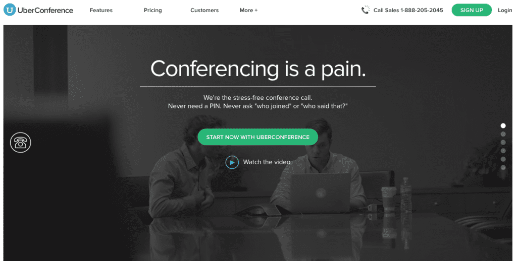
There’s nothing worse than having a conference call where one person gets the short straw and has to take all of the notes. It also can be a pain in the ass to shift between various screen-sharing apps, conference bridges and chat platforms, which UberConference consolidates down into one service.

best apps for startups

The two biggest reasons why we use UberConference for all client calls (besides their ‘awesome’ hold music) are the call recordings and the screen sharing capabilities. This allows all of the team members to be fully engaged with no distractions and gives us and the client the ability to brainstorm or review our latest iterations.

6. Rapportive

Extension | Pricing: FREE

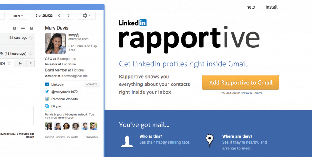
We mentioned this one earlier, but it’s awesome enough to get its own section. Working as an extension for Google Chrome, Rapportive gives you the ability to connect and grow your network with your email contacts.

best apps for startups

Each time you start a new email or conversation, Rapportive will scrape the contact’s email and locate their LinkedIn and Twitter. Without leaving your email message, you have the ability to ‘invite’ the contact to connect on social, giving you the ability to easily stay connected and grow your network.

7. Slack

App | Pricing: FREE with Paid Premium Options starting at $6.67 per user per month

If you haven’t heard of Slack by this point, you’re probably living under a rock. What started as a simple chatting app for offices has evolved into just a great messenger for a variety of uses, from team collaborations to gaming and more.

best apps for startups

We use it daily for work, with at least four different Slack teams within our app that allows us to bounce between our client work and partner work. The number of apps you can integrate into Slack are amazing, including Invision which we use for design prototypes. This comprehensive messaging app that lets you organize conversations, access archives, share files and more. It’s definitely one of the tools our agency can’t live without.

Best Apps for Startups: Social Media

8. Buffer

Web App/Extension | Pricing: FREE for one platform but starting at $10/month for individuals

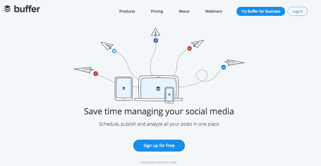
If you only have a few social handles to manage or you’re just getting started, Buffer can be a great asset for you to try out. It is both an app and a Google Chrome extension and gives you the ability to ‘set it and forget it’ for all things social.

best apps for startups

Buffer not only helps curate content related to some of your posts but also allows you to schedule, monitor and review post performance. The extension itself helps you save time by easily scheduling any post you come across throughout the day without having to leave the post and login to Buffer.

9. Sprout Social

Web/App/Extension | Pricing: Starting at $59/month

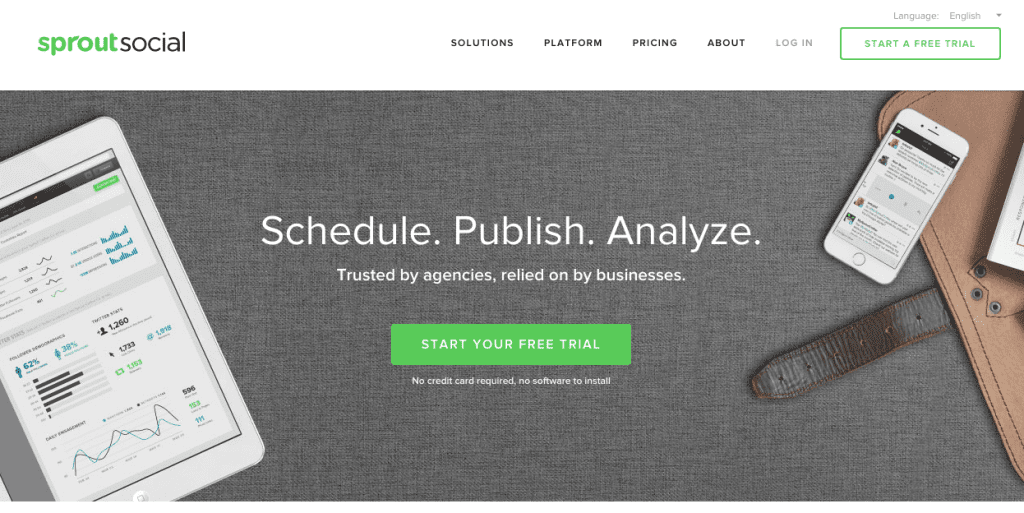
There’s a good chance you’ve already heard of Sprout or could possibly be trying it out now. Sprout is basically what Buffer will eventually evolve into which is an all-inclusive enterprise level social media management tool.

best apps for startups

Depending on the plan you select, you can link up a variety of social handles that can be organized by client. Their reporting features give you more insights on your content and engagement, breaking posts down to the hashtag. If you’ve used Buffer but feel like you’re outgrowing it, Sprout Social is definitely a great resource to try.

Best Apps for Startups: Security

10. LastPass

Web App/Extension | Pricing: FREE

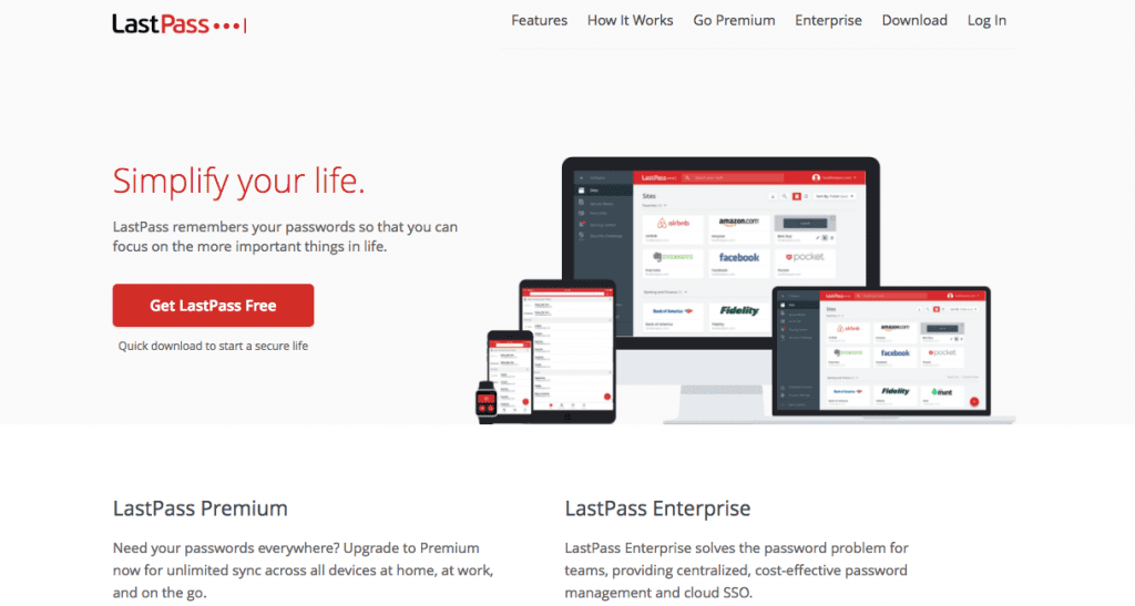
We’re in a digital world and everyone’s top priority is keeping information secure. Clients are trusting you with a lot of personal information, so keeping all of their passwords in a handwritten notebook or Word doc probably isn’t the best means of security. LastPass solves this issue, assuring all users that any information stored within it is safe and secure.

best apps for startups

Logging into different apps and platforms has never been so safe and easy, as you can just click a button and all of your login info is automatically synced. LastPass also helps you share information with other team members, create incredibly strong passwords and organize everything to keep it manageable. If you are handling other people’s sensitive data, LastPass is the platform for you.

Wrapping Up…

Listen, we all know time is money. Why not spend your time on client work rather than silly day-to-day redundancies? Each of these apps and programs gives you the edge against the day, helping you focus on what matters the most which are your billable time. We bet even if you only tried a few of these apps, you’ll be able to up the ante on your workflow and will produce better results!