Category: Apps & Resources

Top Web Trends for 2018

We don’t know about you, but 2017 was a pretty awesome year for us at the Areli Group! With our pipeline stacked, our processes fine-tuned and team continues to grow; we’re ready to take on everything 2018 has to throw at us. Last year’s web trends post was a hit, so we figured we’d continue it this year! Our goal is to help guide your brand towards the features and necessities your website should have to avoid becoming outdated.

Web Trends of 2018

With so many buzzwords flying around the web right now like cryptocurrency, augmented reality and more it’s easy to get distracted or overwhelmed by the latest craze.

You may notice that this list possesses some of the trends we acknowledged last year. We’ve included them again to emphasize their importance as the internet’s landscape continues to evolve.

So let’s get started!

Engaging, Visual Content

The need for more content will only continue to be in demand as each year progresses. Consider how many voices there are out there shouting to be heard across the web. One of the best ways to improve your web presence is to consistently produce original content that keeps your audience engaged.

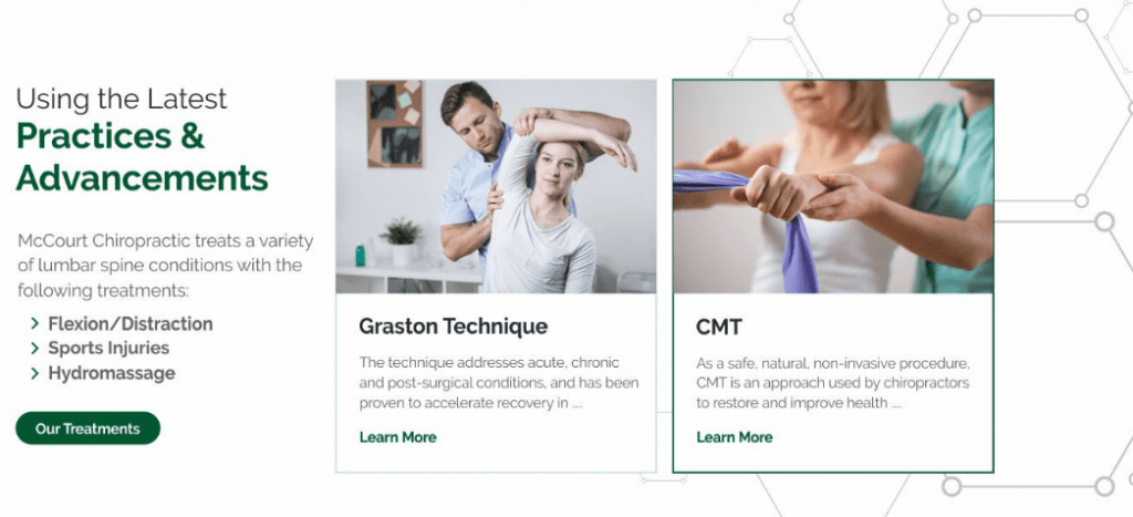
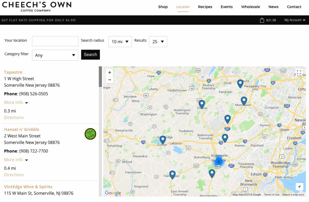
When it comes to showing people where to find your product, pictures can speak much more than words on the page. Just ask Cheech’s Own!

web trends

If you are not utilizing visual content such as branded images and videos then you are missing out on a large part of your potential reach. Applying your content to visual formats can help the content’s exposure as images and videos tend to be much easier to absorb on the move. One way to do this is to use the content in a visually appealing way that reinforces the copy.

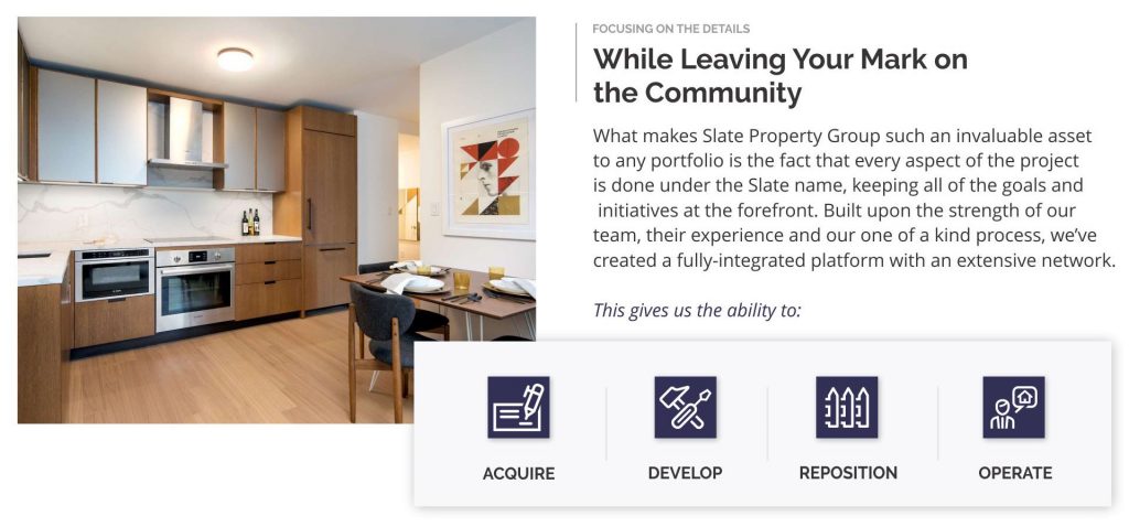
By using a broken grid layout (which we’ll get into more later on), you can guide the user through a smoother reading path than the traditional jagged, alternating content layout.

Vibrant Colors & Textured Patterns

Staying with the visual content category, let’s talk about overall design and color schemes. The prevalence of flat design is still strong. That said, there are attributes about it that are evolving, including the use of textured patterns subtly used in backgrounds or the use of unique shapes.

web trends

Let’s also make one thing VERY clear. It’s 2018, your website should NOT have any FLASH on it. Most browsers used currently do not even support flash anymore, just ask Adobe!

web trends

One design scheme really taking center stage are the broken grid layouts. The stacked look gives the image some depth while drawing the individuals eyes towards the content that matters the most. It will be interesting to see how brands and agencies use this approach in a unique way to stand out.

Online Support

Part of the experience factors for your website includes how certain issues are approached. Are you making it easy for your followers to contact you with any questions they may have? Do you know your audience groups well enough to intuitively offer the answers to their commonly asked questions? Consider the mindset of individuals looking for assistance. They’re usually confused, frustrated, upset or all of the above.

The way you approach a resolution can be a major differentiator between your brand and a competitor. The easier and more pleasant the process, the happier the individual will be. If you are in eCommerce or offer any type of service, customer support should definitely be a top consideration for you this year.

AI & Chatbots

It can be difficult to consider how you can improve or maintain your customer support initiatives while trying to scale your brand. Rather than spreading yourself or your team too thin, consider the use of chatbots and AI. With every year they become a little bit smarter, a little bit more intuitive. While auto-responding bots set for various scenarios may not be ideal for your brand, it could be helpful to gate or direct visitors to certain pieces of content. A great resource to try is Intercom, which acts as a digital concierge for any customer service requests you may receive.

Micro-Interactions

With so much content out there, how are you capturing the attention of your visitors? Besides using the latest web trends and having a diverse amount of content, are you giving your visitors the experience they expect? Through the use of micro-interactions on your website, you can provide your visitors with an intuitive experience they’ve grown accustomed to while having a bit of fun through the development process of your website. From the simple to the complex, your website’s use of micro-interactions could be what sets your website apart from a major competitor.

[codepen_embed height=”500″ theme_id=”0″ slug_hash=”XZOWve” default_tab=”js,result” user=”keitpetrillo”]See the Pen How to Animate a Coffee Drinking Sprite With ScrollMagic by Keith Petrillo (@keitpetrillo) on CodePen.[/codepen_embed]

Accessibility & Security

If you aren’t aware, 2018 is the year for you to keep this on your radar! Over the last few years, new guidelines have been set to assist those with disabilities navigating through the web. Categorically, those with motor, cognitive, visual, or hearing impairments need to be considered as you design and develop your website.

You can find the full set of guidelines here.

Additionally, if your website doesn’t have an SSL certificate you should get that resolved ASAP. Google has made it a requirement, which means not having a secure website in will affect your search rankings and more.

Responsive

This is the last one because at this point it’s not a trend, it’s a necessity. It’s 2018. According to a recent study from socPub, 57% of users won’t recommend a business if they have a poor experience on their mobile site. With so many users accessing the web from their smartphones or tablets, the time to merely consider a responsive framework is over. You need to make sure that when you are in the website design and development process you are working on your mobile version sidecar.

A great example of keeping mobile in mind is Dribbble, which was recently showcased in a post from Invision.

Use What Applies

As always, consider what could work for you and your brand and what doesn’t. It never makes sense to go forth blindly into the year. Put together a plan based on the data you’ve collected in 2017 to ensure any issues are resolved as you move forward.

While many of these are suggestions, keep in mind the importance of accessibility and a responsive layout. Both will greatly help you gain more traction in the years ahead!

Our Favorite Web Apps to Boost Workflow

You are only as efficient as your client. We kept that in mind when we created our process. Our goal was to arm our clients with all of the tools and resources they would need. Ultimately, we wanted to make it easy to collaborate, review and communicate with us. With this at the forefront, we created a toolkit of web apps we use to alleviate the risk of bottlenecks and keep everyone focused on the tasks at hand.

Our Top Web Apps

Keeping all of this awesome information on these web apps to ourselves would just be plain greedy. Let’s take a closer look at some of our favorite web apps and how we apply them to certain situations:

  • Basecamp
  • Slack
  • Jira
  • UberConference
  • Google Apps
  • Invision
  • Coggle
  • Typeform

Basecamp

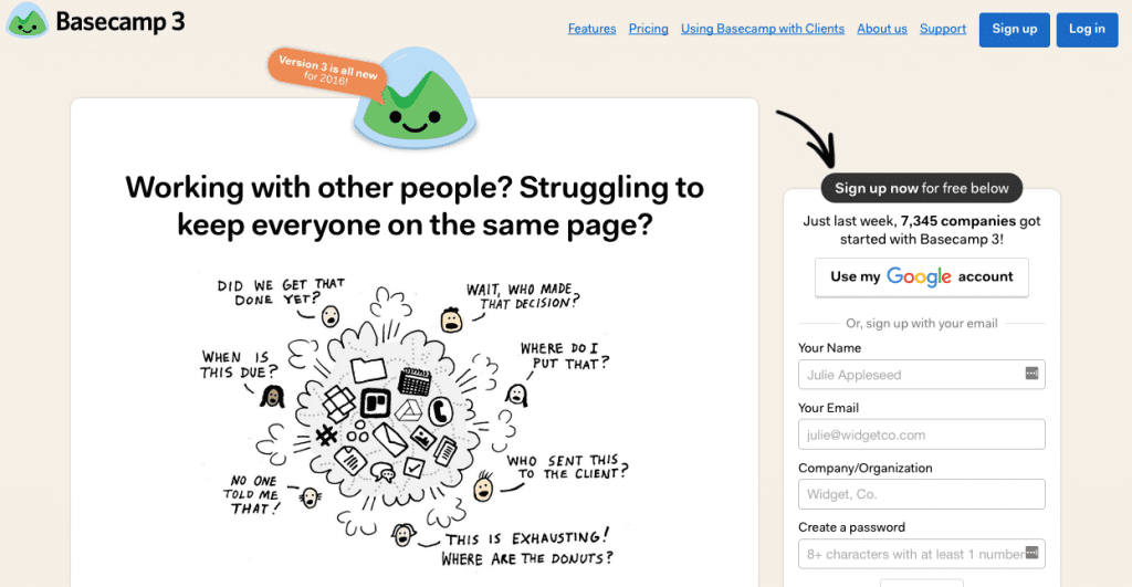
First up in our list of favorite web apps is Basecamp. It’s a great project management tool where you can have discussions, set tasks, deadlines, and share/store assets. Think of it as a task manager on steroids, complete with sharing permissions and more. 

best web apps

If you couldn’t tell, we’re big fans of Basecamp. We use it to map out our entire project workflow in their templating. It makes it simple for our clients to track what stage we’re in. Generally, we use Basecamp for two different types of approaches:

Full-Cycle Website Development

For our web development projects, we always start by onboarding the client into Basecamp. We send them a tutorial explaining how we use this dynamic system. From there we navigate through the project, using the platform to communicate and manage creative assets. Living within the Basecamp ecosystem helps us avoid missed tasks, emails and gives us the ability to keep everyone up to date in real-time.

Software Development

During a software development project, there are many times where planning and discussions are necessary without submitting tickets. When faced with these situations we dedicate our Basecamp project to becoming the forum for non-ticket discussions and storing all necessary documentation.  For all other software development related tasks, we use Jira, which we’ll cover later on.

Slack

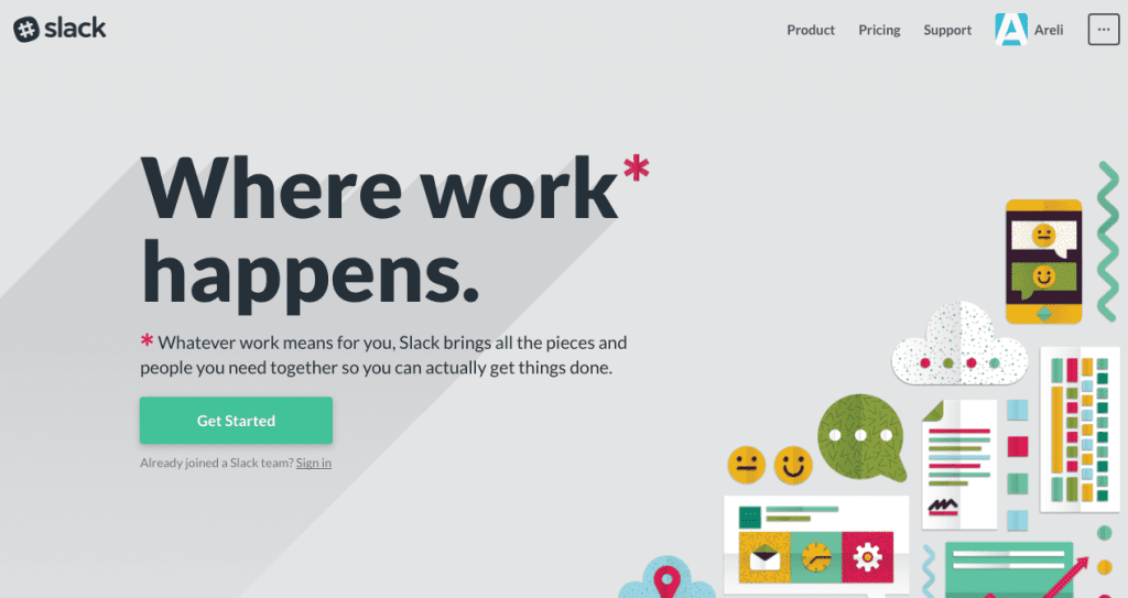
Over the last few years, Slack has become an industry-recognized brand when it comes to communication. They just make communicating with your team extremely quick and simple. Emailing back and forth can be tough, especially if the person is working on a million other tasks. There’s a risk of your email being buried or overlooked, which could leave you unsure of what to do next. Slack resolves this issue through dedicated channels you set. That and a handful of other innovative features that makes it shine among the likes of Skype and Google Chat.

Best Web Apps

If you were to walk up to any Areli team member randomly, there’s a 99.9% chance they have Slack open. For us, Slack is great for quick chats that don’t require a documented thread. If we need to find out about an invite status for a meeting, we can do so without adding to the email fodder. With some of our partners and larger clients, we will actually create a separate Slack team with channels dedicated to specific issues and requests. This way we can stay in direct contact with them within a specific ecosystem.

When it comes to using the asset upload features of Slack we use it more for revision rounds and store the final versions in Basecamp. One of our favorite features of Slack is their customization capabilities including their custom welcome messages and iconography.

Jira

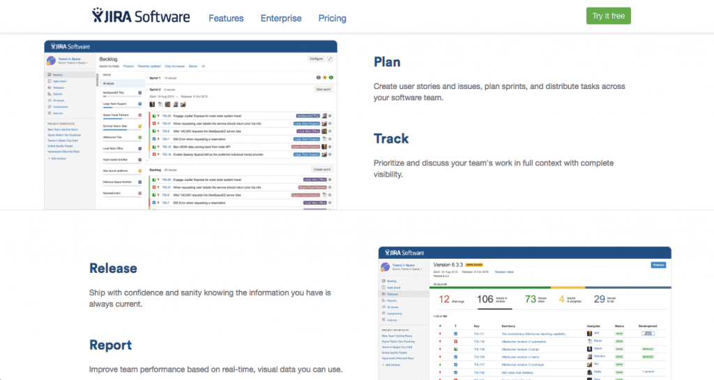
Jira by Atlassian is a great tool for any custom software development team. It helps teams use Agile methodologies to effectively ship quality code at a quicker, more steady pace. With teams of Product Owners, Project Managers, Developers and everyone in-between, compiling a list of tasks can be overwhelming to maintain. When using Jira, anyone can easily add a tagged ticket to the project’s Backlog.

Best Web Apps

Using our backlog list, we have weekly Scrum meetings to create Sprint iterations based on the priority of each ticket. We also consider other factors such as the client’s budget, and our team’s capacity to work on the project as a whole. Because the concept of a Sprint is to self-dedicate to a set number of tickets in the iteration to develop, test and release quality code as often as possible.

Best Web Apps

Photo credit: Valiantys

Jira helps everyone involved quickly see where tickets are in each Sprint iteration with another Agile practice known as Kanban views. Kanban views is a column system with various stages of the Sprint. For our approach, we break down our process into the following columns:

To Do

When tickets are selected for the Sprint iteration, items are marked as a To Do. This acknowledges that they are ready to be worked on.

In Progress

The ticket is moved to this column when the developer is ready to work on it. This column helps the Project Manager easily see what the developer is currently working on.

Quality Assurance

After the ticket has been addressed and the developer is satisfied with their work, the ticket is passed to Quality Assurance for testing. It’s a critical stage ensuring the ticket is functioning as intended. If something seems goofy, it’s sent back to development before it’s sent for client review.

Client Review

After the QA team’s approval, we send it to the client who performs their own test to validate everything is to their satisfaction.

Ready for Release

Once we have client approval it’s queued for release at the end of the Sprint iteration.

Closed

We’re at the last step in the process, hooray! Now that all of the tickets that were committed on during the start of the Sprint should be developed, tested and readied for release. Once released, Jira assigns all tickets to a version number, organizing a changelog of what has been completed in each release.

UberConference

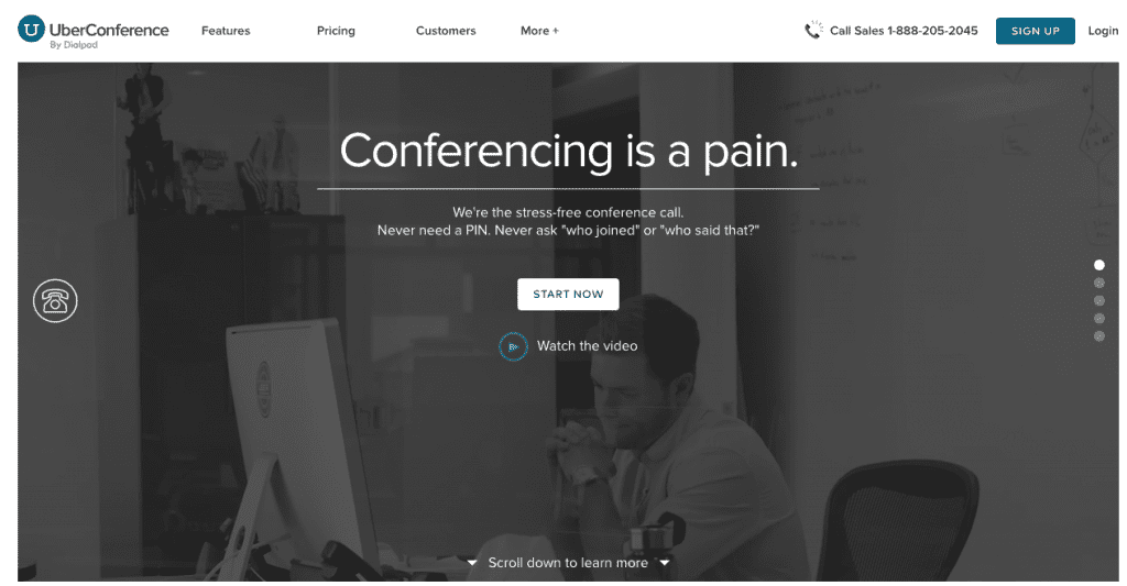
When it comes to conference bridges, you don’t have to break the bank with a robust system or expensive applications from Citrix. You can get the same features for less through UberConference. Once you sign-up you get a dedicated URL, conference line, and the assurance of never needing a PIN again. UberConference’s variety of features makes it simple to communicate with clients or your team wherever you are.

Best Web Apps

For us, UberConference continues to prove its value each and every time we use it. With team members across the country, a dial-in for weekly scrums and client kick-offs they can access via phone or the web make things simple. The environment also gives you the same great features of applications like Citrix, making it extremely adaptive. Some of our favorite features from UberConference are the Screen Sharing and Recorded Transcripts. Both come in handy in client and internal situations for review, accountability, and task management. With a free and paid service, UberConference is definitely a resource to check out!

Google Apps

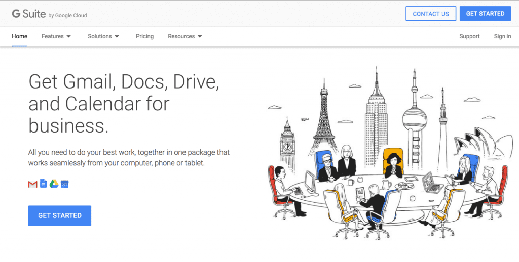
Let’s go beyond Google’s search engine, AdWords, Analytics, and WebMaster Tools. They’re all extremely valuable, ESPECIALLY Google’s App Suite. It’s a treasure trove of tools and features including branded emails, cloud-sharing, and online apps for document creation. Additionally, their storage and document creation ecosystems make it effortless to share and collaborate with co-workers around the world. 

To say we use Google Apps for everything is an understatement. With a virtual agency like ours, collaborating in real-time is crucial. By using their apps, workflow handoffs are seamless while locating the necessary client material has never been easier. Google’s sharing permissions keep roles organized and group email aliases keep the inboxes tidy.

Invision

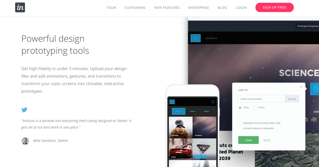
Invision’s prototype web app offers the ability to review and collaborate on project iterations every step of the way.  Similar to Google Apps and Basecamp, you can set various permissions to every project, keeping everything organized. With Invision, you have the ability to invite clients to comment, offer insight on design choices or potential features using Tour Points, and much more. Their user interface makes it easy to identify prototypes pending approval, what is still in progress and keeps the focus on the prototype. A running transcript of comments also helps keep track of any outstanding issues or items that still need to be addressed.

Our clients and team members have fallen in love with everything about Invision. For our clients, they love seeing the mockups firsthand and being able to comment on it directly. Other annotation tools can be clunky, and no one wants to waste paper when they don’t have to! We’ve been able to create an invaluable experience to our clients through the use of their Tour Points and Boards. Our team went head-over-heels for all of the integration features with Sketch, Photoshop, and Zeplin, in addition to gaining a centralized area for all creative inspirations. Their blog posts also offer amazing insights on everything from the business-centric to whimsical. If you ever have some time to kill, definitely check out some of their posts!

Coggle

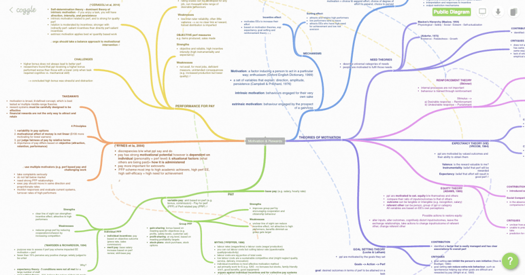
Sometimes, during the early stages of a project, nothing beats a blank workspace for planning. Visualizing the bigger picture and breaking it down task-by-task can be a pain in a text document or spreadsheet. Mind-mapping is a great way of staying organized and Coggle provides you with everything you need to plan away. Furthermore, whether you are strategizing, writing a book, or developing a website, Coggle’s interface and features can visualize your project at hand. Using their branches, colors, linking abilities and more you can stay organized while ensuring everyone always has an eye on the bigger picture.

Initially, we only used Coggle for Sitemaps and Information Architecture. We would plan out a website’s framework using branches before submitting it to the client for approval. It didn’t take us long to understand Coggle’s potential within our company, and started using it for anything related to planning. Now, we use it for everything, including content strategy and biz dev planning.

Typeform

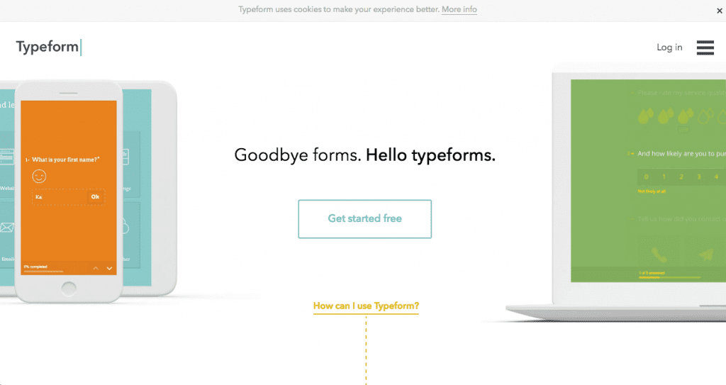
Customer experience is the cornerstone for all strong brands. Over the last decade, there has been an increase in brand surveys and reviews. To be honest, most of these surveys suck. They usually lack anything engaging, which makes them ineffective. That is unless you’re using the web app Typeform. With their platform, brands are able to create an experience rather than a survey. Their customization features allow brands create surveys in-line with their identity while adding their own personal touch in their questions.

Best web apps
Our projects always begin with a Discovery phase, where we identify pain points, locate assets, and review overall client goals. By using Typeform, our clients now have an easy and efficient way to provide us with all of the answers we’re looking for, without being invasive. Along with branding our surveys, we are able to create questions in our own voice. The process remains as a conversation than an interrogation which has resulted in better insights.

To Sum It Up – Our Favorite Web Apps

For us, all of the web apps we mentioned above are irreplaceable. The exceptional results that our clients have come to associate with the Areli name because of this toolkit we’ve created.  Explore some of the web apps above and be adventurous! While these are our favorites and work well for our needs it doesn’t mean they’ll do exactly that for you. Don’t be afraid to try out some new web apps and see which work for what you’re trying to accomplish.


If you’d like some more ideas on other web apps that could help, be sure to check out our other post, the 10 Best Apps for Startups.

Best Practices: What is On-Page SEO?

on-page seo

With so much information accessible, it’s crucial for brands and businesses to have the ability to stand out from the competition. Depending on your budget, a large marketing and advertising push may be beyond what you can afford. The question remains though, how do you get found for the right items or services? Regardless of your budget, your efforts should be spent building up your local presence in search engine rankings through search engine optimization, especially on-page SEO.

Consider the behavior of a typical consumer. When looking for a product or service, they search one of two ways:

Method One: Broadly search for a type of service or product

Method Two: Search for a brand/business/location near them

Ultimately, they have a question and are looking for an answer. By using a strategic SEO-based approach in your content, you can appear in the search results and offer them an answer.

What is On-Page SEO?

This post will break down the major elements that contribute to search engine rankings. We will discuss topics such as focus keywords, content formatting, meta information, local relevancy, and tools to use. While there are many facets of SEO, this guide will cover the foundations of On-Page Optimization.

Focus Keywords

Focus keywords are search strings and phrases that you want to be found for. They are the basis for on-page SEO tactics. An example would be a company selling clothes would use ‘clothing, apparel, or dress clothes,’ in a variety of focus keyword phrases. They are extremely important to search engine optimization. That said, Google and other search engines have become increasingly more attentive on SEO methods and will actually penalize a website for just ‘stuffing keywords’ into content that offers no sort of value whatsoever.

The solution? Make your content as genuine as possible. Always consider the user and how they would find the content you are providing. If you are trying to use the phrase, ‘clothing in New York,’ your content should talk about how your quality or methods make it the best (a reinforcing statement can go a long way) rather than just saying – ‘We have the best clothing in New York.’

Long Tail

Long tail focus keywords are full search phrases that could potentially be used. This includes stop words, which separate focus keywords and overall phrases such as ‘in, or, to, of, etc’ ← This is sometimes unavoidable and can benefit more than hinder (it’s much more organic/genuine)

An example of a long tail focus keyword phrase: ‘the best clothing in New York’

Short Tail

A short tail keyword is just the string of words you want to be found for. Using the example above, the short tail keyword would be: ‘clothing.’

Variations

While using a focus keyword throughout the content is important, you also need to use variations of it as well. The overuse of one keyword will hinder more than help while variations help you rank among other similar search results.

An example of the above in a different form would be ‘NY Retail shop’ or ‘New York apparel’

Density

As stated above, keyword density plays a major role in your search rankings. This doesn’t mean use the keyword in every sentence, or even in every paragraph. The percentage should always be between 3-5% – meaning if you have a page with 100 words, the focus keyword (not including variations) should be used 3-5 times.

Research

Finding a keyword you can compete for can be complicated or frustrating at times. Using Google’s Keyword Tool requires an Adwords account but there are some free keyword finders that can be helpful. When it comes down to it, it’s better to use the keywords you feel describes your brand, consider what you want to be found for in search results.

H1 H2 Formatting

One of the components to focus on during the content strategy phase is how you will integrate the focus keyword into each page. Consider the keyword as the framework and the content as the padding and finishing touches. At the start of each page, your focus keyword should be an H1 or H2 title, which also helps search engines rank the strongest pages. Basically, if you’re using the keyword in a header, Google will push your page higher than one that just has the keyword in the body copy. This is because a whole section devoted to the keyword is much more valuable than a mention in the copy.

Keeping the example going from above an H2 could be, “Find the Best Clothing in NY”

Meta Information

Remember the whole concept of making a good ‘first impression?’ The meta information for your page is what the consumer will see in the search results. It’s also what helps Google and other search engines pull the right results for the right keywords. This means it’s imperative that you have the focus keyword in the meta information.

Title

The title of your page should reflect the keyword or phrase a person would search. If you are a local company that tailors suits and want to direct people to your contact page the Meta Title would be ‘Tailored Suits’ You have about 100 characters to work with. Our recommendation would be to format the title like this: A Perfect Fit: Tailored Suits from Brand Name

Description

Your meta description needs to reinforce the title. Your title is the hook, the description is the line. You need to create a catchy meta description that includes the focus keyword to reel them into your site.

Slug/URL

The page URL should also contain the focus keyword or variation of, to cover all bases. This also helps search engines weed out the good content from the bad.

Image Optimization

When you think about your content, are you factoring in the visual assets you have on your site? Even the file names and alt tag fields of the media you upload onto your site play a role in your search engine rankings. It’s always good practice to save your images and videos under the focus keyword you will be using for that page, along with using a variation of the keyword in the alt tag field.

Local Relevancy

Getting ranked locally can be easy to do, but it can also be hindering. It’s extremely easy for someone to think that listing out each city or location along with the focus keyword would be the best way to rank. Years ago, this was definitely the case when it came to on-page SEO. Because of how rapidly SEO changes though, a lot of those old-school techniques will now get your penalized. Top on-page SEO factors now go for quality over quantity. Your best bet is to use some of the following methods throughout your content:

  • Use the focus keyword and the overall local area you’re trying to rank for only once or twice.
  • Integrate the local areas you want to rank for within the content itself, rather than creating multiple pages with duplicate content.
  • Use variations of the area and keyword.

IF you are trying to rank locally, here’s one other thing you can do – Google, the most popular search engine tends to rank their own products above other sites. This means if you have YouTube videos (with a keyword title) or even a Google+ page for the location, it can amplify your optimization efforts.

Tools and Resources

For more information on getting started with on-page SEO, definitely check out these resources. Don’t get overwhelmed, there’s a lot to learn when it comes to SEO!

Yoast

One of the many SEO resources we utilize. Their UI makes it extremely easy to assign focus keywords to pages, create meta information, and determine the strength of each page. It’s a great asset to have to ensure the basic SEO fundamentals are set on each page. 

Backlinko

Brian Dean is a distinguished SEO influencer who has made a career in helping websites rank higher in search results. The information he offers in his blog is always full of great insights.

Moz

I had mentioned alternative solutions for Keyword research along with overall site strength. Moz and their product, the MozBar definitely helps accomplish these two tasks. Their Keyword Explorer works just as well if not better (although you need to purchase a plan – Definitely worth it!) and their MozBar shows you broken links, Domain and Page authority (both are major components to the overall strength and effectiveness of your website. They even have a collection of Local SEO tools you can find here.

Also, each Friday Rand Fishkin (one of the original Moz’zers) does a Whiteboard Friday discussing new techniques for SEO and Content. You can always find a lot of great valuable insights here.

QuickSprout

Neil Patel is another major influencer in the website performance and SEO industry. He shares his insights and experience through his blog, where you can find a lot of great information and tips on how to boost your page’s performance.

Keep in mind

This is just one of the many moving pieces to SEO. Optimization efforts are always evolving though, which means certain methods can become irrelevant pretty quickly. As long as your ultimate goal is to provide high-quality content around a focus keyword, you should be okay in the long run. It’s always a good idea to keep a pulse on the industry as well which can help you get a leg up on your competition.


Getting Started: Website Development and Design Basics

Whether you currently have a website or are in the process of creating one, there are a lot of basic fundamentals your finished product must contain. While many will look for the ‘cost-effective’ routes of doing it in-house with limited platforms like Wix and Squarespace, those who want to really succeed will understand that more effort and capabilities are needed to stand out among the competition.

At this point, everyone is connected to the web in one way or another. From smartphones and mobile devices to services like telemedicine and mobile payment processing, everything is connected to the constant stream of data surrounding us. While this makes it easier for brands to connect with their consumers, it becomes a double edge sword when you consider the amount of time and effort required to remain ahead of the competition. This post will give you an idea of website ‘must-haves’ to stay competitive.

The process of creating or even redesigning a website can be overwhelming, but it doesn’t necessarily have to be. In this post we’ll cover the basic fundamentals your website should definitely possess while offering some insight on how to actually get it accomplished:

  • Choosing a CMS Platform
  • Content Strategy
  • Responsive Design
  • Search Engine Optimization
  • Brand Alignment

Where to Begin? Website Development Core Basics

Let’s start off by discussing how to choose the right CMS platform to use as the foundation of your website. A CMS platform is a content management system, a software that is used to create and manage, you guessed it…content. You have your basic platforms, your custom CMS infrastructures and even those that are created for high volume, enterprise levels of content.

There are a lot of great options out there with different capabilities, including:

Our preferred CMS is WordPress.

When you’re looking for the right CMS for your brand, consider what your needs are. What are you trying to accomplish? Unless you’re a big brand looking for enterprise level integrations and capabilities, such as churning out a ridiculous amount of content across multiple websites WordPress tends to be the ideal choice. The amount of customization, open integrations, and capabilities of the platform makes it a powerhouse CMS in the right hands.

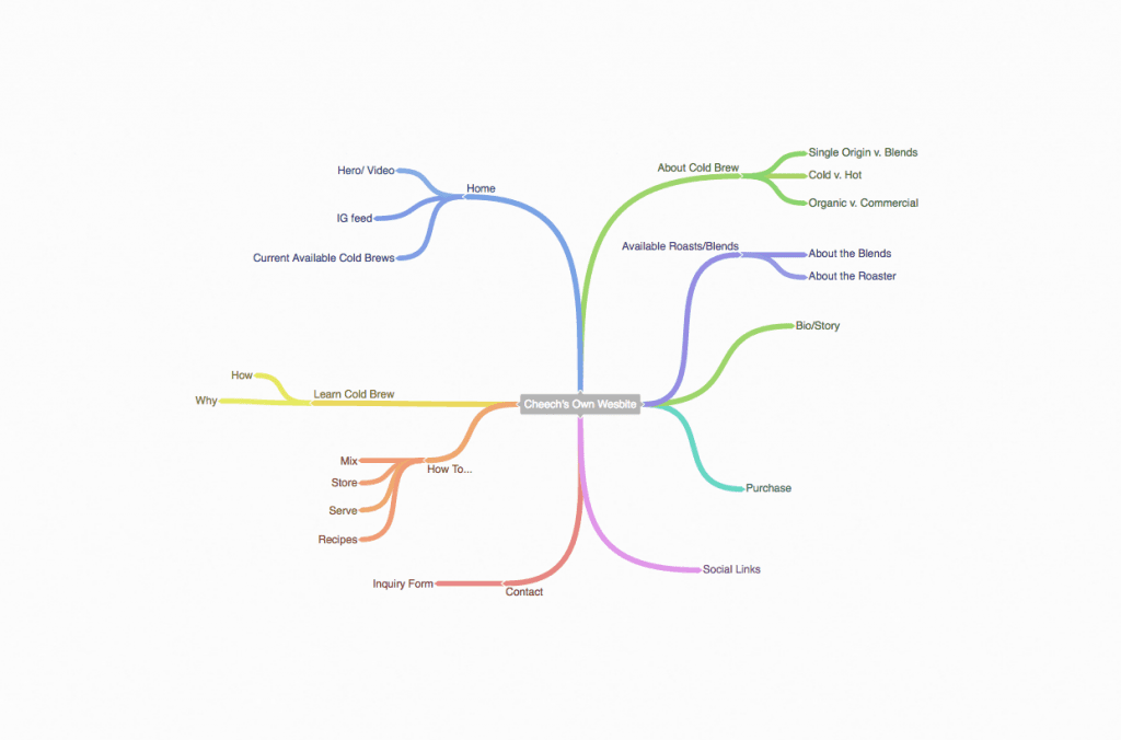
Now that you’ve selected the right foundation for your brand, you can dive into the structure or layout of your site, which lays the blueprints for the overall design and aesthetics. For us, we use Coggle to create sitemaps and outline the content for each page. A mind map is a great tool to use so you can focus on the specific purpose of each page while remaining mindful of the bigger picture goals. Here’s an example of how we use Coggle during the planning phase for most of our projects.

Once you’ve adjusted your sitemap based on your needs and have a CMS platform in hand, here are the other four key components of any killer website:

  • Content Strategy
  • Responsive Design
  • Search Engine Optimization
  • Brand Alignment

Content Strategy

Regardless of what you may read or what you have experienced in the past, content is king. Without it, the result would be similar to a ‘big-beautiful Cadillac with no engine.’ It may look amazing and snappy on the outside, but there are no guts to hold it together. In future posts we’ll definitely be focusing on your content strategy but until then, here’s what you need to keep in mind:

  • Your Target Audience
  • Overall Goals
  • What’s Your Value Prop?
  • Keeping Content in the Queue

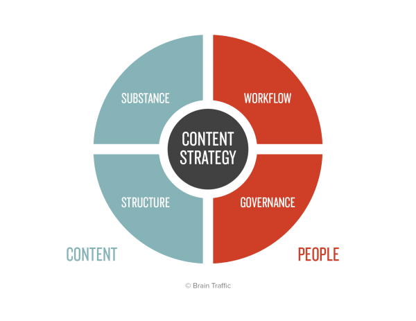
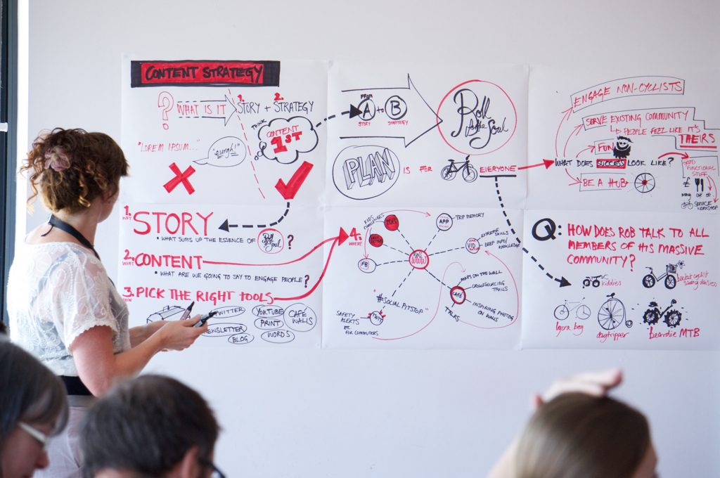
The Content Strategy Quad, copyright Brain Traffic

Your content strategy spans across your entire brand, with your website being one of the cogs in a larger machine. After you’ve identified the right messaging for the right audience, there’s much more work to be done. As you create or redesign your website, consider how your messaging will play a larger role in your content strategy. Each of your value props should be a running theme for all of your blog posts, social media plans and more. Every message, line of copy or blog post should serve an overall purpose, whether it’s solidifying your brand as an influencer, increasing your followers or improving your conversion rate. You should never go into drafting blind, and you should always have a clear idea of how this piece fits into the puzzle.

Responsive Design

We’ve spoken on this topic before, but it remains true and will only continue to increase as the years go by and technology improves. Having a ‘mobile-first’ type of mindset will allow you to create an overall positive experience for all of your visitors regardless of their preferred device. Using a responsive design approach gives you the ability to ensure your website looks just as good on any mobile device as it does on a desktop. That’s the ultimate goal, isn’t it?

Consider how often people are on their smartphones and tablets versus on their desktops. We always have our phones on hand, and will constantly use it for research and browsing purposes. When creating or revamping your website, you need to consider how you can provide ALL Of your visitors with the best web experience regardless of the device. Keeping your information easily accessible is the best way to increase your page on-time and engagement metrics.

Search Engine Optimization

There’s so much noise out there on the web, it’s difficult to differentiate yourself even with all of your experience and credibility. One aspect that many companies fall off with is in their rankings. What are you doing to keep your website at the top of search results? Are you being found for the right terms and keywords? Search Engine Optimization is a fickle mistress, constantly changing her needs and wants based on the habits of consumers. What may have worked years ago is not guaranteed to work now, especially if it was closer to black hat techniques. That being said, it’s absolutely necessary to keep your finger on the pulse and identify the best tactics that will help your brand stand out.

At the very least, your website should have all of your meta-information optimized, a focus keyword for every page and overall configuration for efficient loading times. That’s only the beginning. Looking at the bigger picture, your overall content strategy and your SEO efforts should be working in-line, as you can’t have one without the other. Well, you can but it won’t really do jack for you. The more optimized content you produce, the more links you have pointing back to your website, the higher you will go in search rankings. More importantly, search engines like Google then consider you a much more credible source, which also affects your search performance.

Be sure to lookout for our upcoming post on best practices for SEO to learn more about how to get started.

Brand Alignment

If you’re going to take the time going through the entire web design or redesign process your ultimate goal should be to keep your overall strategy and approach aligned. If you have any silos within your brand working on different things, take a moment to understand how this can result in a disjointed, inconsistent appearance and actually hinder your brand in the long run. You create a stronger brand when you are all on one page rather than working on your own goals.

A unified approach gives all of your teams the perspective they need to understand how their responsibilities fit within the company’s overall plan or vision. It’s a great way to keep your team engaged and more importantly, will create more effective results than you were receiving prior. If you’re going to invest the time and money into a website or a redesign, it’s imperative that you also align your strategies to follow the launch and capitalize on the momentum.

To Sum it Up

In the end, the most important aspect of any web redesign or build is to remain focused on the big picture while taking care of the specific tasks at hand. Any distractions or loss in momentum can affect how cohesive the finished product is. Your overall goal should be to ensure a seamless approach with your other efforts when launching. Finding the right CMS platform, creating a strong content strategy, and keeping mobile in mind when designing will get you started on the right track. By using the insights offered above you can make sure you are taking care of the core fundamentals to your website.


Why You Should Build Up Your Brand Awareness

improve brand awareness

Over the last 20 years, technology has made the leaps and bounds the Jetson’s once teased us about. With video chatting, virtual reality, and smart homes just to name a few, we’ve become connected in ways we could have only imagined three or four decades ago. As the world and consumer behaviors change, it means businesses that once dominated the landscape must also learn to adapt to the resources at hand. We briefly touched on the subject in our recent Web Trends post, but we wanted to dive into the fast-paced digital world a little deeper to emphasize how important it is to improve your brand awareness online.

In our post we’ll cover:

  • The modern consumer
  • Exposure and competition
  • The need for digital
  • Common issues you may face
  • Tools that can help

Regardless of how successful you were twenty years ago, there is no sustainability without a strong digital component.

The Modern Consumer

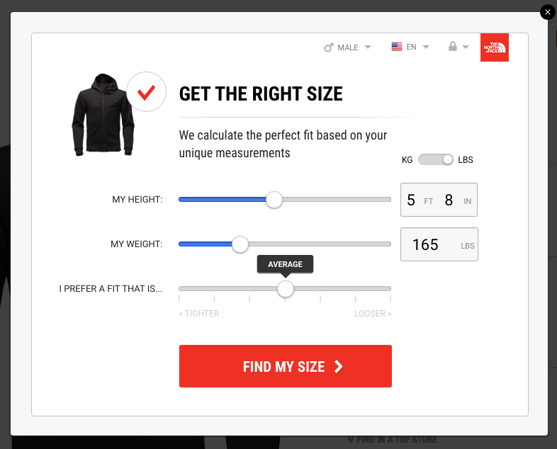
Today’s shopper has the same needs as consumers twenty years ago but has more resources available at their fingertips. Rather than browsing through a catalog or physically walking into a store, shoppers now have the ability to review products, purchase and even get fitted for them right online. A recent experience with North Face’s online store made it apparent to me how far the digital world has actually come. Their sizing algorithm is in-depth and quite accurate, keeping the shopper engaged through the entire process.

improve brand awareness

With that said, their basic needs have remained the same, they want the best value for their money with as much convenience as possible. When both of these are met, they have no problem becoming an advocate for the brand and sharing their purchase or experience with the group of peers on various social platforms. On the other side of the coin, a negative experience will also garner the same outcome with unsavory results.

At this stage it doesn’t matter if you’re a retailer or a service provider, we’re all selling something to an audience of buyers. If you don’t understand their shopping behavior, it will be difficult for you to convert leads into long-lasting customers. Without any skin in the web game, it’s near impossible for you to compete with your industry peers or sustain any type of growth.

Which leads me to my next point…

Your Competitors are Already On

Just because you don’t see a need for the web doesn’t mean that’s the bottom line. I bet if you did a quick search right now you would find that a majority of your competitors have been putting a lot of their efforts into their digital presence, whether it’s social, a website, an app or all of the above. And those are just the competitors you know about. The web has given everyone the ability to start their own stores or brand which has left the landscape quite congested. How are you standing out? Even if you had the best services or products, if you’re not sharing your experiences or pushing your audience to promote you, your brand won’t be able to scale at the pace of your competitors.

Right now you could be thinking, well my clients are all from strong relationships I’ve personally built and I want to keep it that way. Okay… but what are you going to do when your sales funnel starts getting light and you have no plans on reaching new prospects or retaining your current clientele? What’s stopping you from taking that ‘strong relationship building process’ and applying it to a sales strategy on the web? Rather than seeing the web as an unnecessary aesthetic component to your brand, consider it as your brand’s full-time representative.

The Need

Your modern consumer has certain characteristics that you need to accommodate. When it comes to conversions, those who can offer visitors the right information in a convenient and engaging way will win. Those who lack the answers, take days to answer inquiries or have zero to little web presence tend to fall by the wayside. They become forgettable, as consumers only way to deal with those who can help them immediately. Call it the age of instant gratification.

Even if you already have a website, are you meeting the needs of your followers and potential customers? When was the last time you checked into your analytics to see how your pages are performing? Having a website isn’t enough, it’s really about the meat and potatoes. Your design can be appealing, your messages can be engaging, but if that’s where the content ends your brand won’t be able to perform.

My recommendation would be to audit your data and content you can identify potential pain points your customers may have in addition to your website’s overall weaknesses. From there you can create a stronger content strategy and use certain automation and chatting tools to help visitors find the right information they need.

Common Issues

It can be difficult to figure out where to begin. You’ve probably read hundreds of posts discussing what you should and shouldn’t be doing, but how do you get started? If you don’t have a website, start there. For those of you that do have a website, ask yourself the following questions:

  • Is the design responsive and appealing?
  • How are your pages performing?
  • What type of content is your competition producing?
  • Are you blogging consistently?
  • Do you have a way to capture potential leads off-hours?

More than likely you were unable to answer yes to all of the above questions. If you did, you’re either lying to yourself or you are ahead of the game. If it’s not the latter, you’ve got some work to do. But don’t panic!

Your best bet is to tackle a couple of these initiatives at once. While you are transitioning to a responsive and appealing website, create a content strategy that offers more value than page views by reducing your bounce rates and increasing time on page. Also get a list of blog topics you can run with while the site is in the development stage and reach out to industry influencers to start building relationships. This will really help when you start pushing blogs and want to increase your reach. From there, things will start to fall into place, but don’t relax just yet. There’s plenty to do.

Tools to Help

While all of the points we touched upon are extremely important, it can be difficult to see the value when your team is already focused on the day to day operations. Finding extra time throughout the day to devote to these responsibilities can be close to impossible for small to mid-sized teams but it is feasible. Your best bet is to take it one step at a time while keeping an eye on the bigger picture.

When it comes to a transition or digital initiatives outside of your wheelhouse, my recommendation would be to hire a creative agency that has the proficiencies you’re looking for. You’re not the first client to face these issues, and they know the necessary steps to take to get you up and running. This way, you can still focus on the business aspects of your brand while gaining the reassurance that you have a group of creatives in your corner looking out for your best interests.

If you are averse to working with creative agencies (for whatever reason that may be) there are some alternatives. While they may help you get a grasp on certain aspects such as automating your website or creating a content calendar, keep in mind this is one small cog of the larger machine. Transitioning to the web or putting more emphasis on your digital identity is not a part-time gig, so be prepared to work longer and harder as you take on more. The downside of taking everything on is burnout, which is more than likely when you’re working twelve hour days trying to handle everything for your business and digital initiatives. If this is the route you want to take definitely look into these types of tools to help you efficiently take on more:

Schedulers

Whether you want to accept it or not, social media is an extremely important aspect of your brand. It acts as a medium for customer service while making your brand relatable and engaging. Finding the content to post each day can be a daunting manual process though which is where scheduling apps come in. With apps like Sprout Social and Buffer, you can curate and schedule content for the whole month in mere hours rather than taking time each day searching for content and manually posting.

improve brand awareness

Most of the scheduling apps even have other features such as content recommendations and native monitoring that helps you engage with followers and potential customers based on keywords, allowing you to easily find the conversations relevant to you and your brand.

Design apps

Please tell me you are not creating your marketing collateral or designs within PowerPoint or Paint. You’d be surprised with how many times we’ve encountered this in the past. If you want to be taken seriously, you have to take your brand seriously. It’s time to advance to the big boy design tools to reclaim your brand with consistent, professional assets. Here are some of our favorite apps that we’ve used:

Creative Cloud

improve brand awareness

When it comes to design a name that always stands out is Adobe. In the past, their software was somewhat intimidating due to the price and all of their capabilities. The Creative Cloud helps to alleviate that, as Adobe now offers their entire creative suite for a monthly subscription based on your needs. With access to their forums and resources, learning how to navigate and utilize their suite has never been easier.

Sketch

improve brand awareness

As the new kid on the block, Sketch has had some pretty big shoes to fill when it comes to designing. Their app is similar to Adobe Illustrator and InDesign, but their user adoption is much more welcoming. While they make it extremely easy to open up and learn on the spot, there are certain limitations within the app that can make it somewhat frustrating at times. My biggest qualm is the fact that their app is a native software download, which prevents teams from collaborating from one joint account. It’s definitely worth exploring though they always offer a free 30-day trial.

UX Pin

improve brand awareness

If you have a vision for what you want your site to look like but have no experience in design software like Adobe or Sketch, give UX Pin a shot. Their tool is used by a ton of big brands for everything from website wireframes to mobile app mockups and more. Their web app interface makes it easy to just pick up and get started, but there are certain limitations that lead designers back to apps like Sketch and Adobe. If you are just getting started and want to lay out your ideas, UX Pin can be a great resource for you to try.

Canva

improve brand awareness

I’m a little bias when it comes to Canva. I use it a lot throughout my work week for various projects, usually in the realm of social media and email marketing. It is definitely one of the easiest design apps to pick up and learn, and they offer a lot of great, free content for you to use. With layouts specific to industry dimensions and a slew of web fonts and designs for you to choose from you can easily create branded images and visuals in a matter of minutes. Don’t expect a web app version of Illustrator or Sketch, though as Canva has very specific uses. My favorite aspect of Canva is their business version, which automatically defaults to your branded colors, fonts and set characteristics each and every time you create a new design.

Optimization

When you are trying to get your brand out there, optimization is an absolute must to start your journey to the front page of search results. I could go on for days about the different apps or methods you should take to get a footing in optimization but here are some of the resources you should definitely start utilizing:

SEM Rush and Moz Bar

When it comes to analyzing your competitors, no tools are better than what SEM Rush and Moz Bar offers. Both will scan your competitor websites for focus keywords, outbound links and page authority, which all play a large role in rankings. By understanding the approach your competitors are taking you can see where you fit in the landscape and create a plan to dominate.

Yoast

For those of you using WordPress as your CMS platform, Yoast makes it extremely easy to optimize your web pages while giving you prompts and tips to strengthen the page. It goes one step further, offering a readability score which can affect on-page times and bounce rates as well. Try the plugin out today to see how you can create a strong website and digital foundation for your brand!

Email Marketing

Staying in touch with your customers and generating leads is a must for your brand. Using email marketing apps can definitely help your efforts, but use it in moderation. Unless your followers are asking for tips daily or you have a special promotion going on, try not to bombard them with emails each day or week.

improve brand awareness

Your best bet is to use it as a method to keep your consumers updated while offering incentives on your website to entices others to opt-in.

MailChimp and Constant Contact

Here are two of the resources that you should definitely try. Both of these are great web apps, making it simple to integrate opt-in forms, create specific lists and produce branded email templates that look phenomenal on desktop and mobile. When it comes to choosing between the two, it really depends on your personal preferences and budget. You should definitely check them out!

For a larger list of some great web tools to add to your arsenal, check out our post on the 10 Best Apps for Startups you should be using!

Continuing to Learn

Bringing your brand to the digital realm is no easy feat and should not be considered something that can happen overnight. Like any big sale, client relationship or marketing strategy, building your brand up on the web is a calculated journey. Taking the right approach and making the right decisions will help, but it’s always better to take your time rather than try to rush to the finish line. For more advice on what you should be focusing on, take a look at our Web Trends for 2017 post. And don’t forget, we do this for a living, so if you’re looking for some guidance on a particular topic we’re only a quick email or tweet away. Good luck!

Top Web Trends for 2017

2016 had its fair share of ups and downs, but one thing is for certain. The power of the web and digital marketing is growing exponentially, which can be great for some and daunting for others. If you’re slow off the starting line for transitioning into the digital realm, don’t panic. There are a lot of simple ways to bring your brand to the digital landscape, going beyond the traditional website format and a handful of social posts. Let’s take a look at some of the top web trends that picked up quite a bit of momentum in 2016, and how they will play a role in the years to come.

In a nutshell, we’ll highlight the importance of:

  • Mobility & Responsive Design
  • Flat Design’s Evolution
  • Content’s Overall Impact
  • Diverse Content
  • Quality Over Quantity
  • Creating a Personalized Experience
  • Micro-Interactions
  • Filling in the Gaps with Automation
  • Destroying the Silos
  • Real Data Over Vanity

We hope that with some guidance, your journey through the digital world will be less scary and more exciting!

Mobility & Responsive Design

According to a report by Ericsson, 80% of the world’s population will be smartphone users over the next 4 years. That’s over 6 billion people with the ability to access the web, apps and more right from their phone, no matter where they are. In 2016, there were more consumers browsing the web on their smartphones than desktops, which means you need to start considering your mobile design first and foremost.


top web trends

For us, mobile always comes before desktop. There’s no point in spending all of this time on a website that looks great on desktop and like crap on mobile. Just think of how you search for information when you’re on your phone versus desktop. A responsive design requires more thought on the overall user experience. How are you providing your visitors with the information they’re looking for in the easiest and fastest way possible? Is your page loading at the mercy of large files and encumbered with complicated functionality? The days of pinching and zooming in to read text and navigate is over. You need to put mobile first.

Flat Design’s Evolution

Even if you’re not familiar with the term, you have definitely encountered a fair share of flat design examples over the last year, and there doesn’t seem to be any sign of stopping. Using a minimalist approach and vibrant color schemes, flat design quickly replaced skeuomorphism as the industry standard for all digital design facets. Through the use of simple shading and contrasting colors, flat design has helped users navigate through websites with more ease while creating an immersive experience.

top web trendsPersonally, we’ve always been fans of flat design. Skeuomorphism always seemed a bit off to us, and the amount of detail they require always came with large image file sizes that would bog loading speeds and overall site performance. By keeping it simple and using a minimalist approach you can flex your creative muscles by creating a flat design that looks great on everything, while also optimizing your site’s page speed and efficiency.
As 2017 progresses, be sure to transition your graphics and branding to a simpler look mirroring the characteristics of flat design to help your brand stay relevant and not look outdated!

Content’s Impact

It has become pretty simple for anyone to create a website or blog. That said, the web has become congested with people sharing their personal content hoping to go viral. With all of this noise, it can be difficult for brands to get their message out there to the right audience. Still, producing content is better than just ignoring it. Whether you are a startup, a small business or a big brand, you should always be producing content. It’s the best method to prove to visitors and potential customers that you are a credible influencer in your industry.


top web trends

Content is key. Without it, you cannot successfully sustain your business. If anything your site will become stagnant as your competition advances. It’s also incredibly difficult for consumers to trust a brand that has no content to support their claims. Consider this, would you trust a surgeon if they couldn’t explain to you the process you are about to undergo? The web is no different, if you’re offering it, you better have the content to show off your proficiencies. A strong content strategy can also help you scout the landscape much better and understand potential opportunities to improve your overall customer experience. Just ask yourself, with all of the competition out there how will you separate yourself from the rest?

Diverse Content

While content is extremely important to your brand, you can’t rely on just a few blog posts each month to pick up traction. As I stated earlier, there is an influx of content being produced every day, every hour so how will you stand out among the rest?

Consider these stats from Contently 

In 60 seconds:

  • 4 million people like Facebook posts
  • 2 million users favorite Instagram
  • 350,000 tweets are pushed
  • 7 Million Snapchats are watched

top web trends

As unfortunate as it is, we’ve become a generation of headline skimming to absorb our information. Our attention spans struggle to keep us focused on the material in front of us for more than a minute, which requires a new approach to publishing content. There are still those who love to get nerdy and read pages and pages of blogs but to accommodate all of your followers, a diverse format strategy is necessary. Visitors have different methods of engaging with content, and the results of trying new methods can be surprising. If you’re going to take the time to produce the content, you may as well do it right. Don’t rely on just a blog post to get your voice out there, get diverse and creative with your content formats. Experiment with podcasts, videos, live streams, and webinars to offer your audience more in ways they will love.

Quality Over Quantity

This point and the two above about content go hand in hand. Don’t kill yourself to produce content, be realistic. If it takes you a month to script, shoot, edit and post a video, so be it! Don’t bite off more than you can chew as you will hurt your brand more than help it. When you have a consistent posting schedule consumers can look forward to new posts and information. If you start out the gate with a post a week and are not able to sustain it, it can reduce the amount of trust they have in your brand.

Whenever we’re planning out our posts or engaging with others we ask ourselves, how does this provide value to others? If we can’t answer the question easily, we go back to the drawing board. Your followers aren’t sheeple, they all have different views and beliefs. More importantly, they all know the difference between real content and click bait. Constantly churning out content that’s just ‘meh’ is the fastest way to tarnish your credibility. You may get an influx of visitors in the beginning, but that won’t last long. They’ll grow tired of your antics and stop visiting or sharing. You can quickly go from an influencer to a spammer in that sense. Quality should translate to all aspects, including your designs, social engagement, customer service and more.

Creating a Personalized Experience

One aspect of the web that has become extremely important in the last few years is the overall user and customer experience. With the competition congesting your industry, an effective method to standing out is to offer more out of the overall experience a consumer has with your brand. This broadly covers everything from your website’s overall page flow, making information easy to find, and more. Make each visitor or customer feel special from the attention and personalization of the website to offer an experience they will surely share with their peers.

Throughout this post, we’ve discussed how it is important to differentiate yourself from the competition. If there is one top web trend to follow from this post, it’s improving your overall customer experience. We all want to be treated with the attention we feel we deserve, and we all want to feel special when visiting a website. Ask a peer to navigate through your site or sales process and get their feedback on the overall experience. Was it warm and inviting or static and cold? If it’s the latter, your main goal for 2017 should be to improve your customer experience. Consider your audience and their needs. What are they looking for? How can you provide them with the information and assets they need? Is it easy to find through your navigation and website?

Micro-Interactions

As we mentioned earlier, we’ve become an impatient generation. We no longer want to just see a page loading bar against a blank white screen. Another one of the top web trends from 2016 was micro-interactions. Micro-interactions (which are interactions within an interaction) play a role in personalizing the overall experience for every visitor, giving them a way to stay engaged with your content or website rather than them getting bored or anxious and leaving the page.

top web trends


We may be in the digital realm, but nothing grinds our gears more than clicking a link and just seeing a stark white page as everything begins to load. It’s the fastest way for us to close out the window and go to someone else’s site. If you are noticing page drop offs, bounce rates, and other discouraging stats, consider adding some micro-interactions to your site or app. Visitors love to discover these and sometimes will go out of their way to show others because of how much they enjoyed the overall experience. If you’re looking for some examples of micro-interactions, just look at your Facebook feed. When you see a post from a friend, you can do a whole lot more than just like or comment on the post. They’ve created a set of ‘reactions’ to offer an emotional connection with a post which brings a new level of experience to interacting with your friends.

Filling in the Gaps with Automation

Now I know you’re probably feeling a bit overwhelmed after reading all of the points we’ve addressed so far, it’s a lot of work! How do you keep track of all of your efforts, post daily, engage constantly and so on and so forth? By automating certain aspects of your work, you can keep your day running smoothly. There are a ton of great assets and resources for you to use out there, from content curators and post scheduling tools to chatbots and more. Many of these have a set it and forget type method, giving you the opportunity to focus on what you need to, while checking in when you can.

For now, automation is helpful, but always keep in mind the human-to-human aspects to interaction. Even if you are using a chatbot to acknowledge and resolve certain issues, don’t let that be the final destination. Always add a bit of human factor to everything you do, so you can keep your brand genuine and stand out amongst the competition.

Destroying the Silos

Another trend that has been gaining momentum over the last few years is taking a more seamless approach. Traditionally, we would push out certain types of content on specific platforms, forcing consumers to traverse through the digital landscape from one social profile to website or another. Now, to provide a better user experience, there needs to be a seamless approach to all of your efforts.

There’s nothing worse than launching a campaign that is not in line with your other departments. It can make you look extremely unprofessional and affect your credibility. By taking the time to understand your brand’s overall initiatives and how each of your departments are involved, you can create an approach that encompasses all aspects. In the end, it helps you create an overall better brand experience through consistency and consumer-driven messaging, which can be a great asset when trying to differentiate yourself from the competition.

Real Data Over Vanity

If you’re monitoring your analytics and social data, keep the following in mind. Forget ‘vanity’ metrics like page visits, likes, followers, and shares. Likes don’t pay the bills, conversions do. Take a deeper dive into your real data, and understand how your visitors are behaving. Look at the time spent on pages, bounce rates, and overall visitor flow. By using real data to improve your site or social presence you can do much more than just fish for likes and shares.

top web trends

We always knew that likes and shares would only get you so far. There’s no ROI on vanity metrics alone. Real data also makes it much easier for board buy-in by showing them the true key performance indicators and a return on investment. If there’s one thing to really consider in 2017, it’s how you are utilizing the data you have been collecting to improve your brand’s overall efforts and performance.

To Sum it Up

While we covered a lot of ground there’s still so much to talk about! We can go on for days about each of these trends. Ultimately all of these top web trends translate into one core message. Digital transformation is key. It’s a sink or swim situation. If you’re not addressing these points above it’s going to be hard for you to stay competitive with all of the other brands. Consider how you can use what you have as a foundation and build off of it. Think about your core messaging and what you want to provide to your clients. Whatever you do, don’t let these trends scare you away from the web. Always keep it simple and go for what you can manage. The rest will start to fall into place once you’ve created a plan. Good luck!