Month: February 2018

Top Web Trends for 2018

We don’t know about you, but 2017 was a pretty awesome year for us at the Areli Group! With our pipeline stacked, our processes fine-tuned and team continues to grow; we’re ready to take on everything 2018 has to throw at us. Last year’s web trends post was a hit, so we figured we’d continue it this year! Our goal is to help guide your brand towards the features and necessities your website should have to avoid becoming outdated.

Web Trends of 2018

With so many buzzwords flying around the web right now like cryptocurrency, augmented reality and more it’s easy to get distracted or overwhelmed by the latest craze.

You may notice that this list possesses some of the trends we acknowledged last year. We’ve included them again to emphasize their importance as the internet’s landscape continues to evolve.

So let’s get started!

Engaging, Visual Content

The need for more content will only continue to be in demand as each year progresses. Consider how many voices there are out there shouting to be heard across the web. One of the best ways to improve your web presence is to consistently produce original content that keeps your audience engaged.

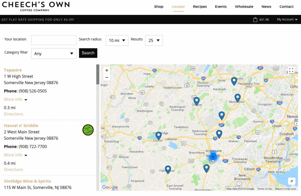
When it comes to showing people where to find your product, pictures can speak much more than words on the page. Just ask Cheech’s Own!
web trends

If you are not utilizing visual content such as branded images and videos then you are missing out on a large part of your potential reach. Applying your content to visual formats can help the content’s exposure as images and videos tend to be much easier to absorb on the move. One way to do this is to use the content in a visually appealing way that reinforces the copy.

By using a broken grid layout (which we’ll get into more later on), you can guide the user through a smoother reading path than the traditional jagged, alternating content layout.

Vibrant Colors & Textured Patterns

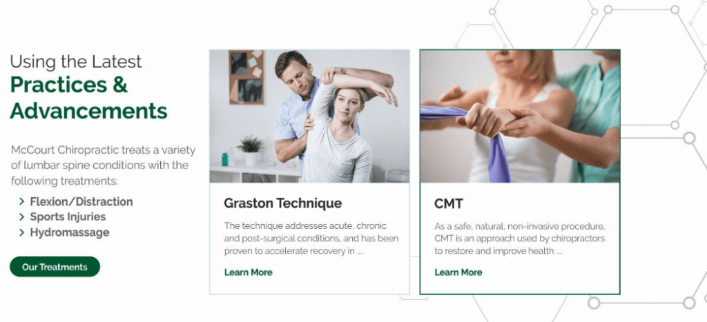
Staying with the visual content category, let’s talk about overall design and color schemes. The prevalence of flat design is still strong. That said, there are attributes about it that are evolving, including the use of textured patterns subtly used in backgrounds or the use of unique shapes.
web trends

Let’s also make one thing VERY clear. It’s 2018, your website should NOT have any FLASH on it. Most browsers used currently do not even support flash anymore, just ask Adobe!
web trends

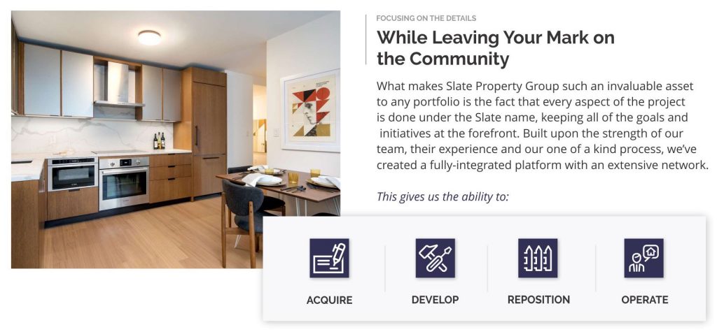
One design scheme really taking center stage are the broken grid layouts. The stacked look gives the image some depth while drawing the individuals eyes towards the content that matters the most. It will be interesting to see how brands and agencies use this approach in a unique way to stand out.

Online Support

Part of the experience factors for your website includes how certain issues are approached. Are you making it easy for your followers to contact you with any questions they may have? Do you know your audience groups well enough to intuitively offer the answers to their commonly asked questions? Consider the mindset of individuals looking for assistance. They’re usually confused, frustrated, upset or all of the above.

The way you approach a resolution can be a major differentiator between your brand and a competitor. The easier and more pleasant the process, the happier the individual will be. If you are in eCommerce or offer any type of service, customer support should definitely be a top consideration for you this year.

AI & Chatbots

It can be difficult to consider how you can improve or maintain your customer support initiatives while trying to scale your brand. Rather than spreading yourself or your team too thin, consider the use of chatbots and AI. With every year they become a little bit smarter, a little bit more intuitive. While auto-responding bots set for various scenarios may not be ideal for your brand, it could be helpful to gate or direct visitors to certain pieces of content. A great resource to try is Intercom, which acts as a digital concierge for any customer service requests you may receive.

Micro-Interactions

With so much content out there, how are you capturing the attention of your visitors? Besides using the latest web trends and having a diverse amount of content, are you giving your visitors the experience they expect? Through the use of micro-interactions on your website, you can provide your visitors with an intuitive experience they’ve grown accustomed to while having a bit of fun through the development process of your website. From the simple to the complex, your website’s use of micro-interactions could be what sets your website apart from a major competitor.

[codepen_embed height=”500″ theme_id=”0″ slug_hash=”XZOWve” default_tab=”js,result” user=”keitpetrillo”]See the Pen How to Animate a Coffee Drinking Sprite With ScrollMagic by Keith Petrillo (@keitpetrillo) on CodePen.[/codepen_embed]

Accessibility & Security

If you aren’t aware, 2018 is the year for you to keep this on your radar! Over the last few years, new guidelines have been set to assist those with disabilities navigating through the web. Categorically, those with motor, cognitive, visual, or hearing impairments need to be considered as you design and develop your website.

You can find the full set of guidelines here.

Additionally, if your website doesn’t have an SSL certificate you should get that resolved ASAP. Google has made it a requirement, which means not having a secure website in will affect your search rankings and more.

Responsive

This is the last one because at this point it’s not a trend, it’s a necessity. It’s 2018. According to a recent study from socPub, 57% of users won’t recommend a business if they have a poor experience on their mobile site. With so many users accessing the web from their smartphones or tablets, the time to merely consider a responsive framework is over. You need to make sure that when you are in the website design and development process you are working on your mobile version sidecar.

A great example of keeping mobile in mind is Dribbble, which was recently showcased in a post from Invision.

Use What Applies

As always, consider what could work for you and your brand and what doesn’t. It never makes sense to go forth blindly into the year. Put together a plan based on the data you’ve collected in 2017 to ensure any issues are resolved as you move forward.

While many of these are suggestions, keep in mind the importance of accessibility and a responsive layout. Both will greatly help you gain more traction in the years ahead!

How to Set a Website Budget

It’s the New Year which means you have some hefty goals to accomplish over the next twelve months. Maybe one of them is updating your ancient website, which has been looming over your head for a while but you’re not sure where to start.

Even if you don’t go through an agency, the biggest task ahead of you for a website project is how to budget it correctly. To do so, you need to understand the factors that are involved, from the technical aspects such as hosting to how you hope align your website with your upcoming business goals.

Do You REALLY Know What You Need?

When you are trying to set a website budget, one of the first things you need to consider is the end goal. What are you trying to accomplish with the new website? A website can have many roles within your company from mere validation to lead generation and increased sales. Refreshing or launching a new website can be a great time to get on the same page with other departments if you have not done so already. Discuss what the overall goals are for the company and what each department is doing to help accomplish this. This will set the landscape for how the end-product can help keep all of the goals aligned. What are some of the technical aspects you need to consider? Are you going to be hosting it yourself? Do you know how to choose a hosting provider or setup a server?

After identifying how the website will be used will help you understand how you should develop your website. There are a few options you can choose from:

DIY Builders

There are a lot of services out there than can help you create a website in minutes. They use drag and drop features to easily lay out your website and populate it with content. If you have a limited technical background and are working with a lean budget DIY builders like Wix or SquareSpace can be a good solution. Keep in mind though, because they are drag and drop, many of these builders lack any true customization which can be limiting. Some may find the layouts to not be aesthetically pleasing and can become frustrated over the experience.

Packaged CMS

This refers to a content management system ready to go out of the box. WordPress is a great example of this, as it is easy to use while still giving you a wide variety of custom features. From themes you can purchase and customize to getting nerdy with the CSS and actual code, WordPress and packaged CMS can be a great choice. We would recommend working with a web developer or agency to design, develop, and configure your website which can affect the budget based on their hourly requirements. By doing so you can get the most out of the platform with the ability to update and maintain the website easily after it is launched.

Custom CMS

If you are a content powerhouse or large company a custom CMS could be a better option for you. Rather than fitting with the confines of other platforms you are able to build yours from the ground up. This is definitely much more technical and would require a skilled in-house creative team or an outside agency to assist you.

Are You Being Realistic?

Two things that can kill any website budget is the timeline and your perspective as a client. You can’t expect to get a Bentley for the price of a Honda. Websites also do not magically happen overnight.

If you want your website designed, developed and launched correctly, there are some aspects to stay mindful of.

Timeline

If you want a website that has been well-thought out, designed around your audience and possesses engaging content and aesthetics you need at least three months. This allows the various teams to acquire the information they need, create designs, revise based on your feedback, and do quality assurance prior to launch. Timelines are also based on the correspondence with the point of contacts, which means if something is on your end for review and it’s been a week, the project will start losing momentum.

Perspective

We all want the best of the best but what we’re willing to spend ultimately determines what we can walk away with. We always suggest creating a wish list, which compiles everything you want in a website and more.

Part of the Areli Group’s Discovery process is comprised of an exercise combines attributes from the MSCW method and a traditional SWOT Analysis.

MSCW Method: (Must.Should.Could.Would/Wish.) During the initial call, we will discuss what your website must have, such as content keypoints, basic functions etc. The ‘should and could’ categories cover features that would strengthen the end-product, including micro-interactions, modals, and more. The ‘wish’ category is purely conceptual, but the discussion alone can help an agency like ours truly understand your full vision for the company in the years to come. You can find an example of the MSCW method here.

SWOT Analysis: When you are taking the time to consider how you can improve your website or overall brand, try doing a SWOT analysis. Pick three or four of your competitors and review the following:

Strengths – What does each brand (including your own) do well? How is each using their content, positioning their brand, and connecting with their audiences? What are they doing that you could be doing as well?

Weaknesses – Whether their website is hard to navigate through, or the content leaves you confused take note. You can use your competitors’ weaknesses as a list of thing you can do better on your end-product.

Opportunities – Once you’ve identified the weaknesses of your competitors you can start to outline potential opportunities for your brand. If your competitor lacks educational content on their site, you can list ‘engaging, educational pieces of content’ as a goal. This way your end-product can offer more value than what your competitors currently have.

Threats – I always consider the threats section as a list of ‘Things to Keep on Your Radar.’ This can include upcoming campaigns, partnerships, social strategies and more based on your research. To me, this section helps put you in the mindset of, ‘Hope for the best, plan for the worst.’

Here’s a good example of a SWOT analysis template that you can use.

From there, you can select the top priorities, which should be features or functions you must have to launch. Consider everything now so you can work through all of the kinks, and reflect on if this project can be done in phases.

Cutting Corners Never Works

As you put the finishing touches on your requirements lists, always remember – Cheaper is never better. Why entrust your six figure company’s website to someone who doesn’t have your best interest in mind?

Working with your in-house team can limit the overall perspective while cheaper agencies and overseas solutions can remain one-dimensional if they’re not considering your overall business. The cheaper the price tag, the less questions they will ask, and the result will be misaligned, and not worth the money you potentially saved.

When It’s All Said and Done

Ultimately it is up to you to set the right budget for your website project. By creating a brief of your requirements and goals you can start asking the right questions to get buy-in from the decision makers. Remember that your website is an asset to your company and should never be undervalued. Working with creative agencies that take the time to understand your overall business goals can be a great solution if you lack an in-house team or just want some outside perspective. Be careful of working with overseas development teams though, we personally have had to rectify and fix many projects that had become misaligned from the client’s needs due of the lack of consideration from them. It’s better to work with a team that has your best interests in mind, from start to finish.